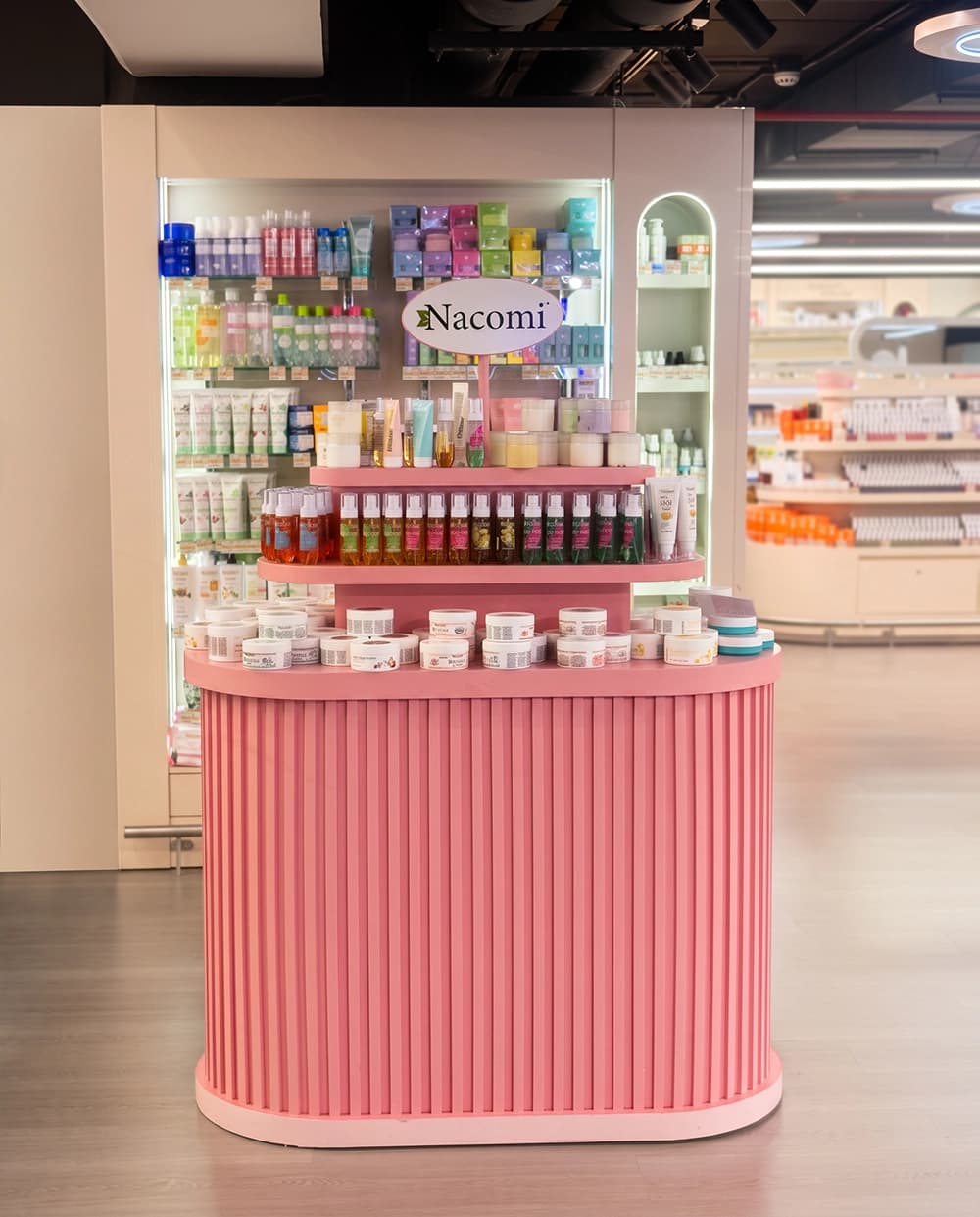


Skin Center
Skin Center sells dozens of skincare brands under one roof, and every one of those brands arrives with its own colours, packaging and visual noise. Left unmanaged, a multibrand store reads as clutter, and clutter is the opposite of what a shopper wants from skincare. The space had to feel clinical enough to trust and soft enough to linger in, and its open mall frontage had to draw people in from the corridor.
The build
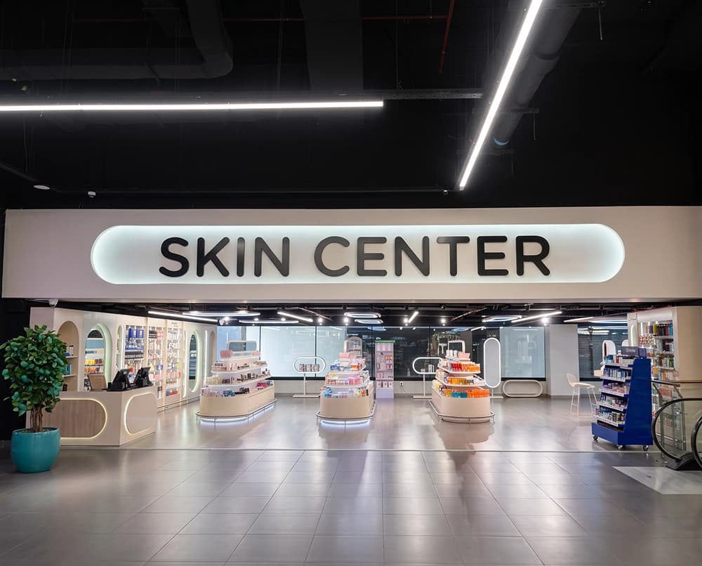
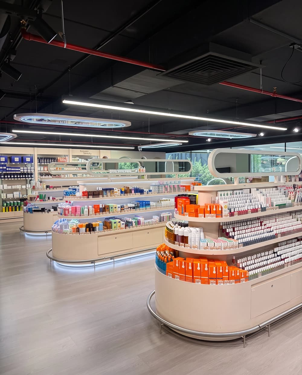
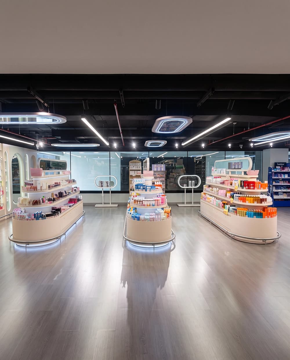
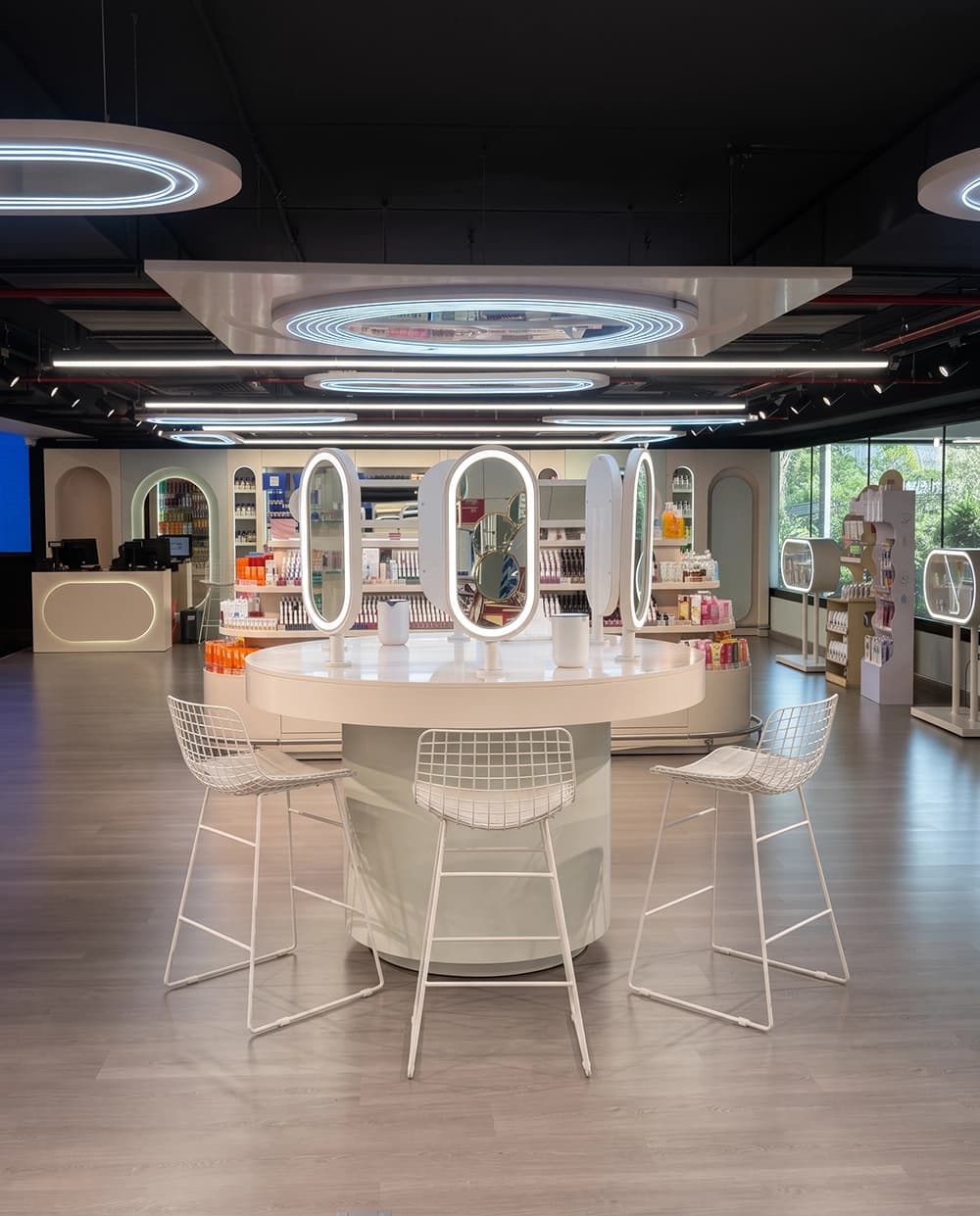
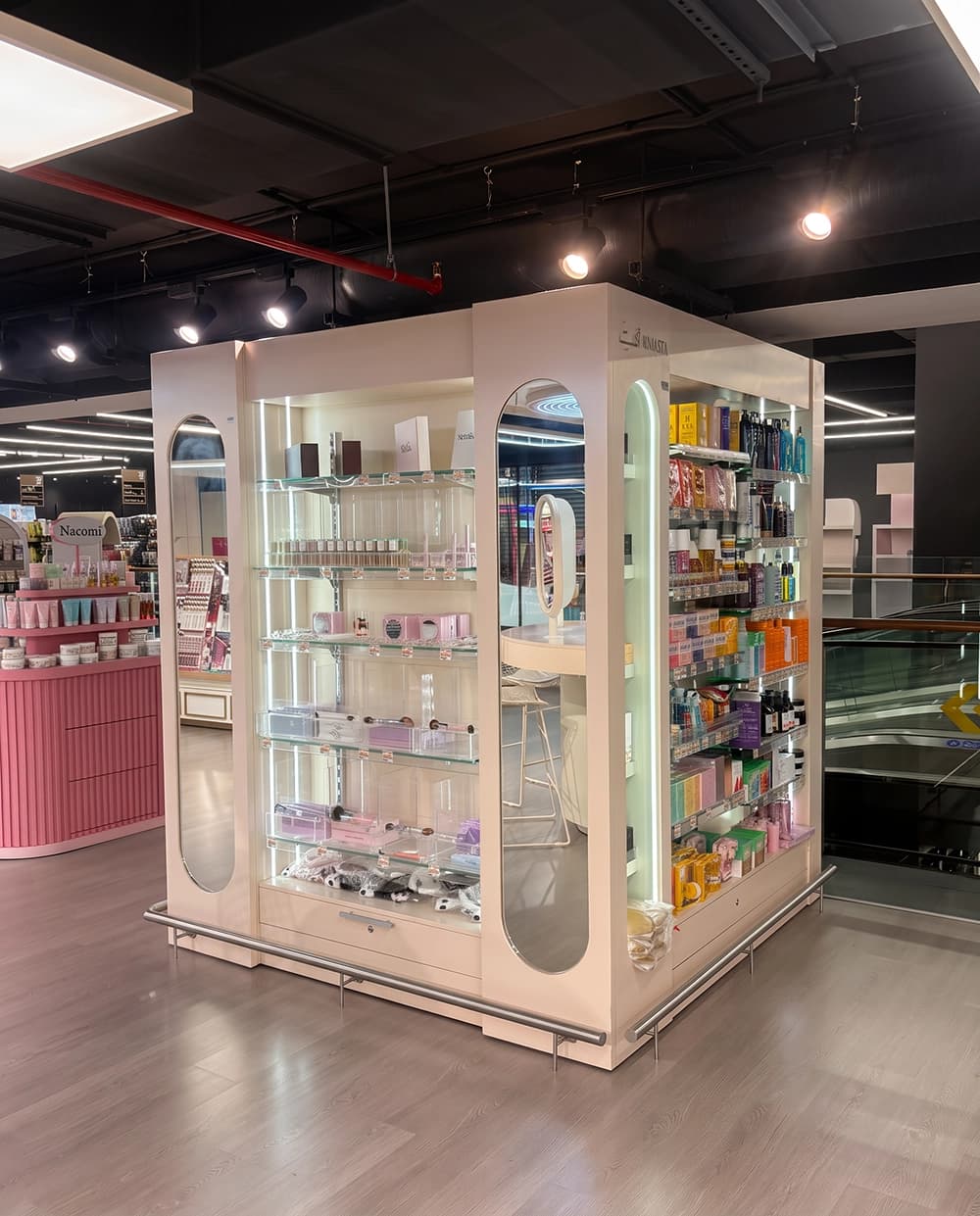
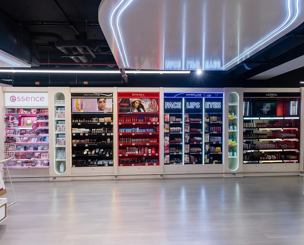
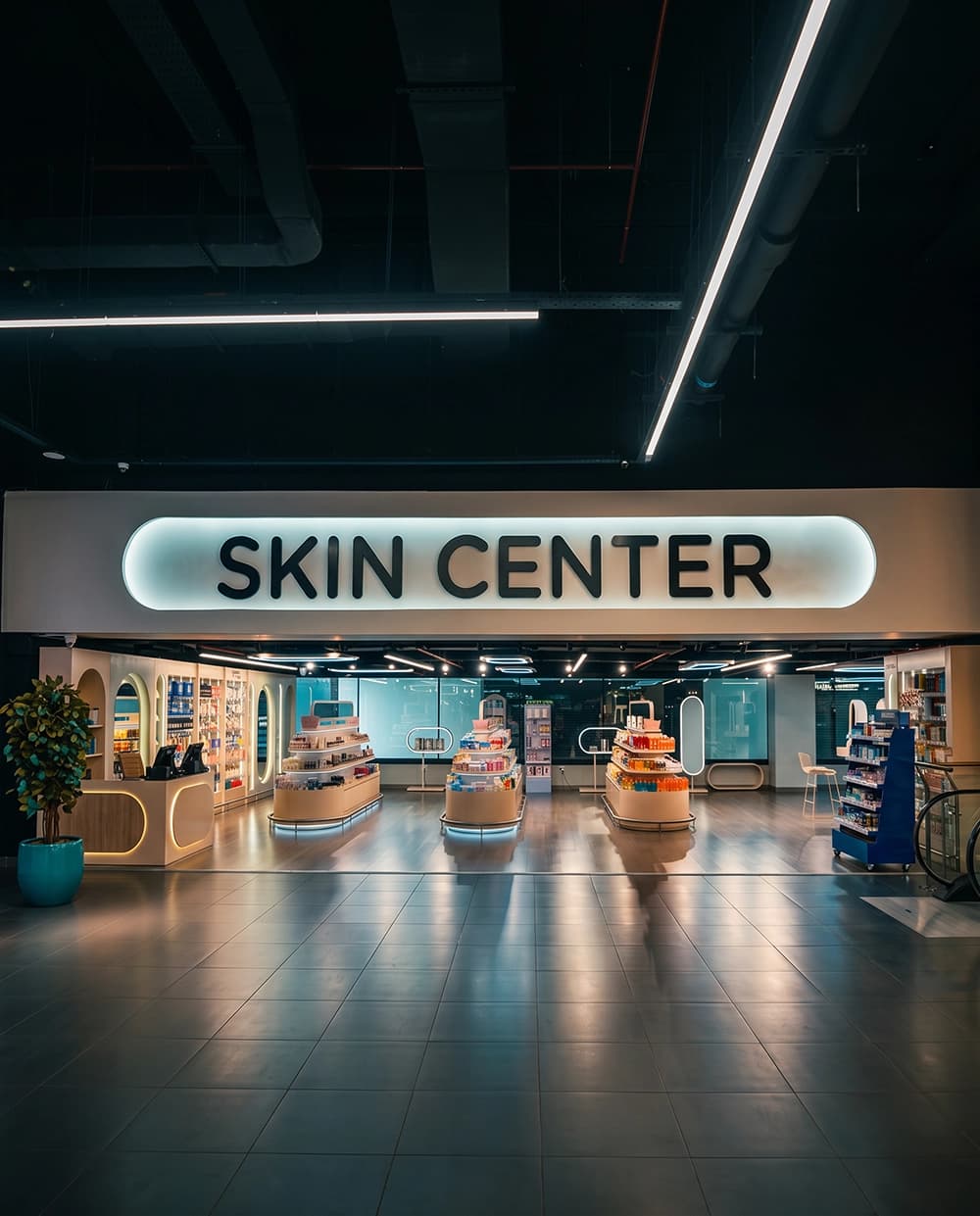
Proink designed and fabricated the store's retail fit out, including a curved service counter, arched wall shelving with illuminated niches, a series of rounded island displays with LED underglow and a backlit signature sign across the entrance.
Softness as a system
There is almost no hard corner in the store. The sign, the counter, the wall niches, the islands and the mirrors all share the same rounded geometry. That single form language does the work a colour palette usually does: it holds dozens of competing brands inside one consistent frame, so the shopper sees Skin Center first and the individual products second.
Open from the corridor
The islands sit low, which keeps a clear line of sight from the mall to the back wall. A passerby can read the whole store in one glance without stepping inside. The light under each island lifts the units off the floor, so the space feels lighter and more open than its stock density would suggest.
A neutral stage for colour
Warm wood tones and a soft aqua back wall stay quiet on purpose. Skincare packaging brings enough colour on its own, so the fit out steps back and lets the product carry the shelf.