

Kitkat Formula One
KitKat became the Official Chocolate Bar of Formula 1, and the partnership had to earn attention in the one place it mattered most: the supermarket aisle. Shelves are dense with competing packaging, and a chocolate bar is an impulse buy decided in seconds. A standard branded stand would have carried the logo but not the energy. The display had to make a shopper feel the race before they read a word.
The build
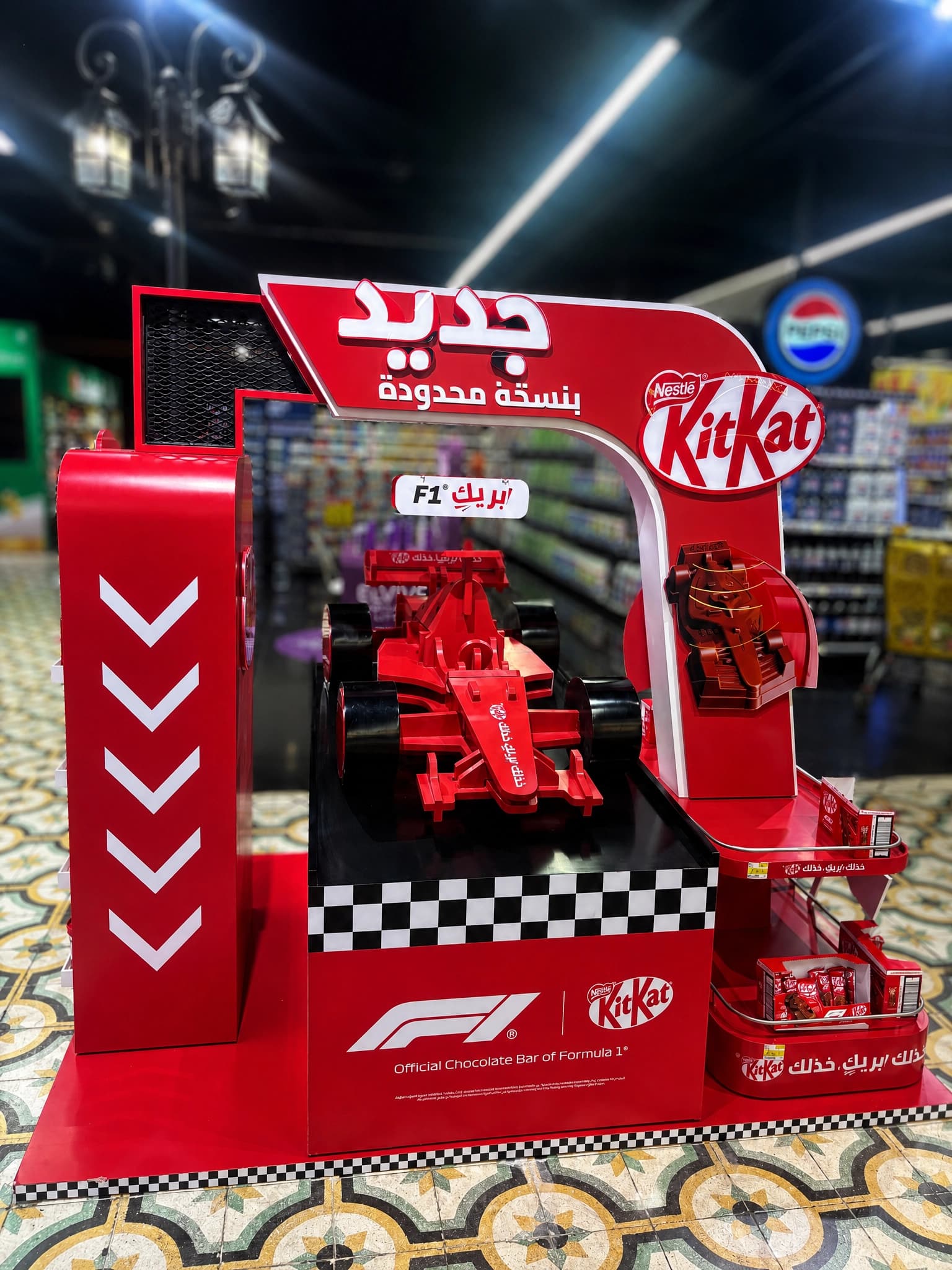
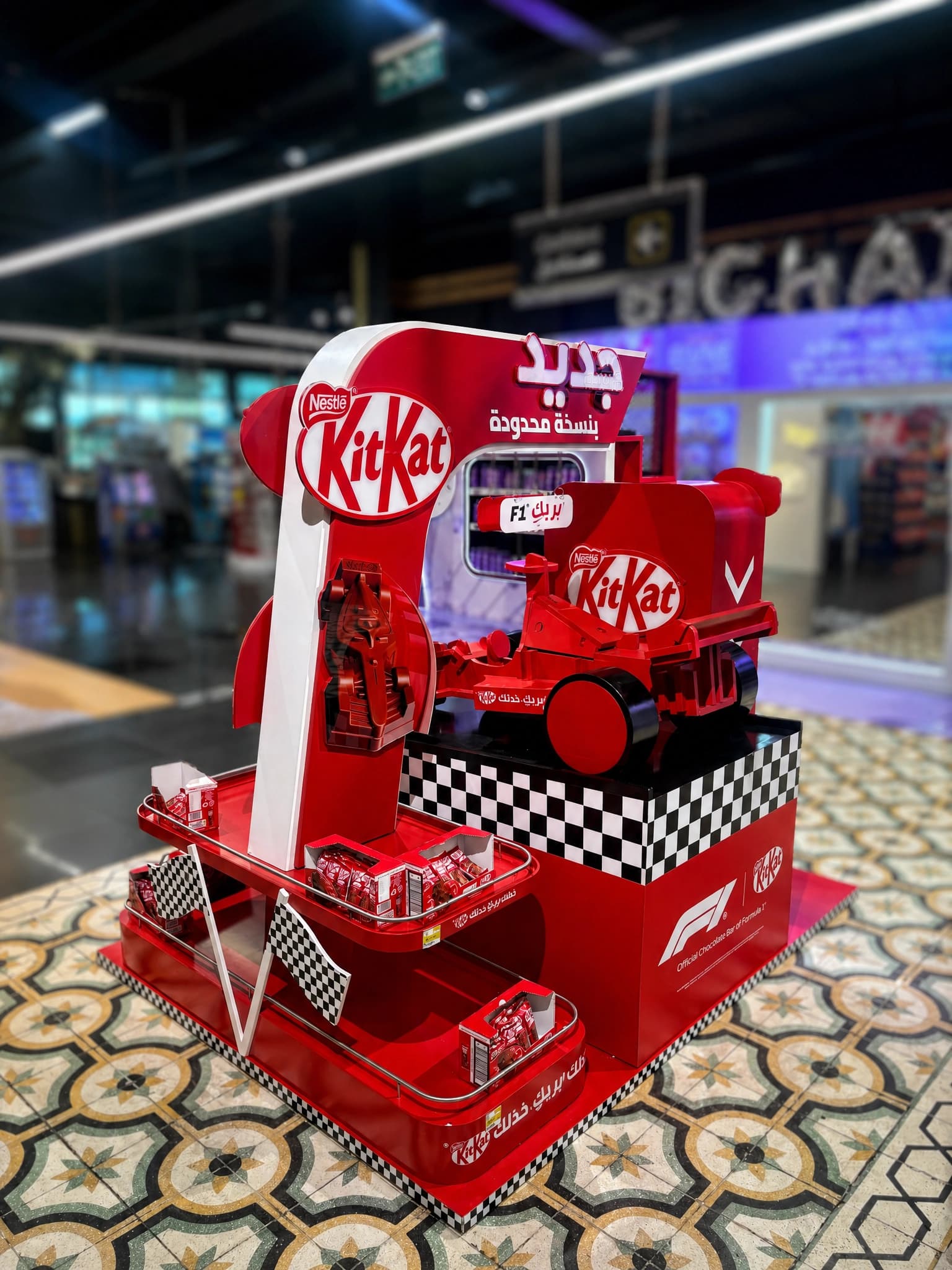
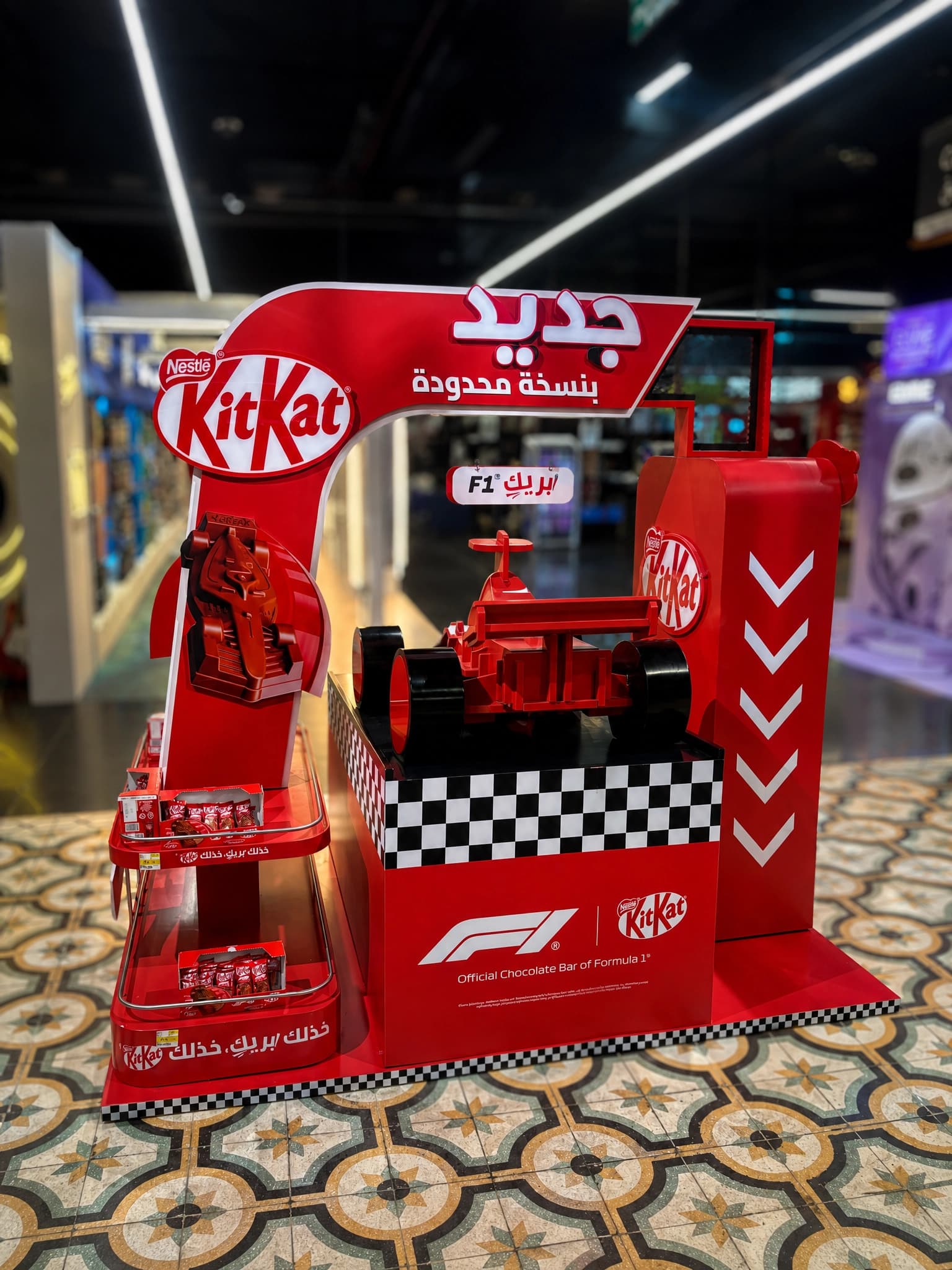
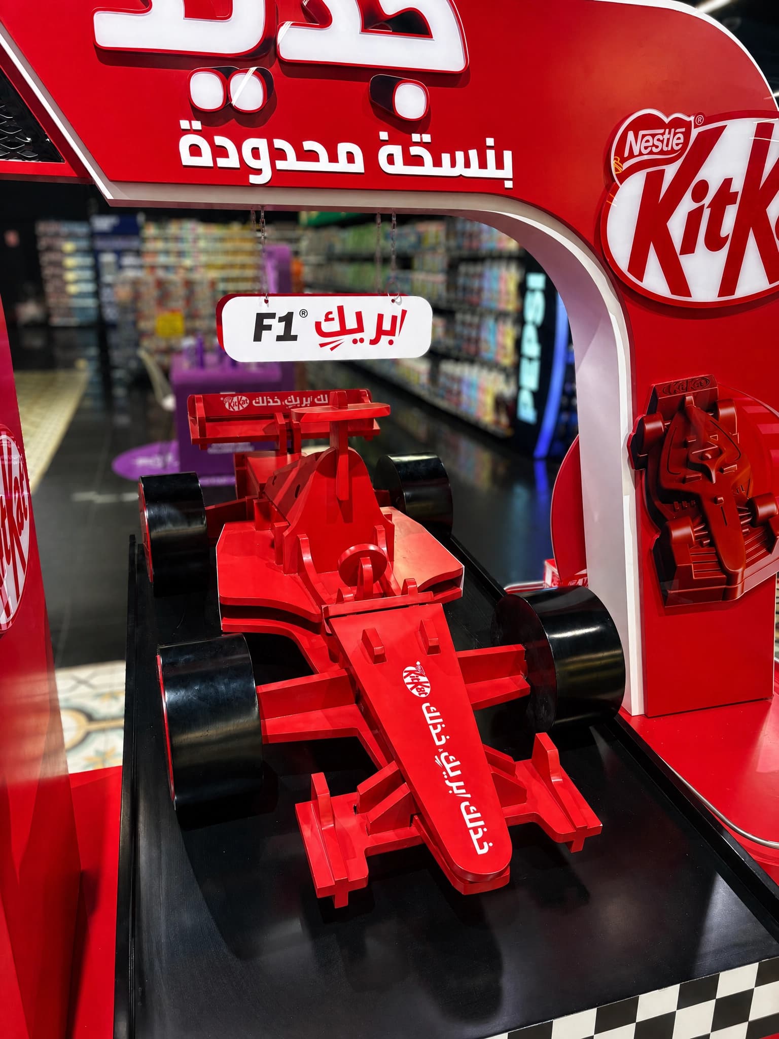
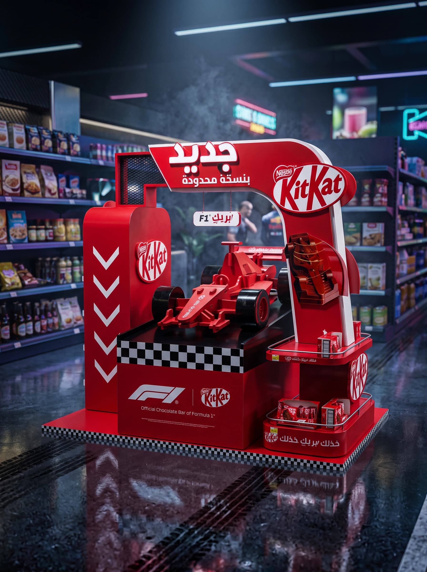
Proink designed and fabricated a freestanding display built around a full scale sculpted F1 car, framed by a branded arch and set on a checkered flag base, with integrated product trays for the limited edition range.
The unit does three jobs at once. The car stops traffic from the far end of the aisle, the arch frames it like a finish line and carries the KitKat mark at head height, and the side trays put stock within reach at the exact moment interest peaks. Attention and purchase happen at the same unit, with no distance between them.
Speed as a visual language
Motion was built into a static object. Stacked chevrons run down the side pillar to pull the eye toward the product, and the checkered base reads as racing before any branding is processed. The F1 identity and the Arabic limited edition messaging sit together, so the partnership lands with a local shopper instantly.
One colour, no compromise
The whole structure carries a single KitKat red across sculpted, printed and finished surfaces. On a shelf full of colour, one saturated block reads stronger than any amount of graphics, and it keeps the brand recognisable from across the store.