

Nescafe
Nescafé was launching value packs, and that creates a quiet risk for a premium brand. The moment a product is framed around saving money, it can start to look cheaper. The display had to sell the value clearly while protecting the perception of Nescafé Gold, and it had to carry two ranges in one footprint without either one losing its identity.
The build
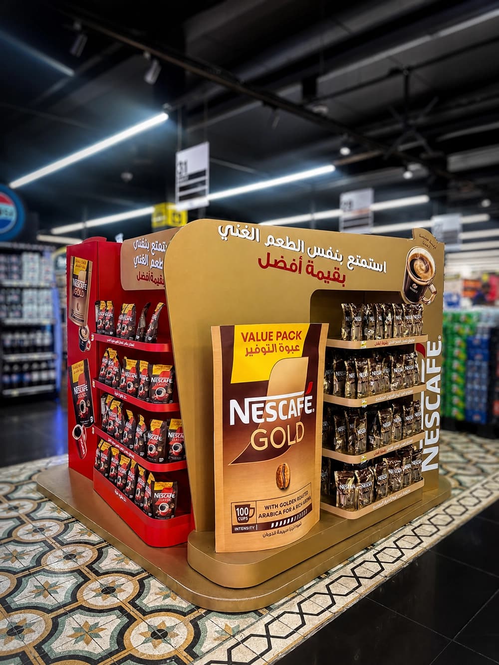
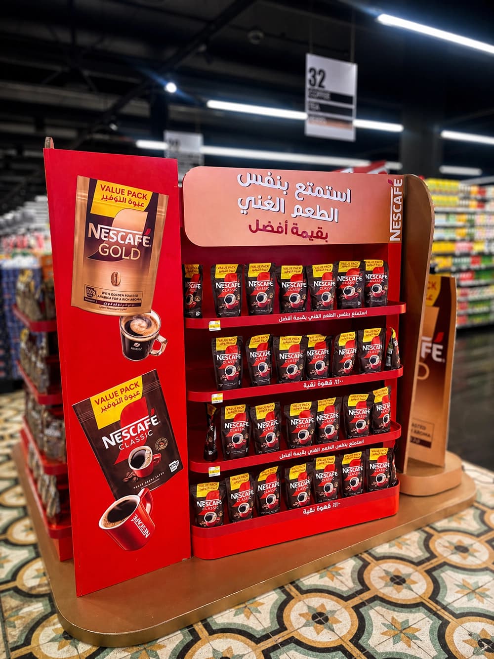
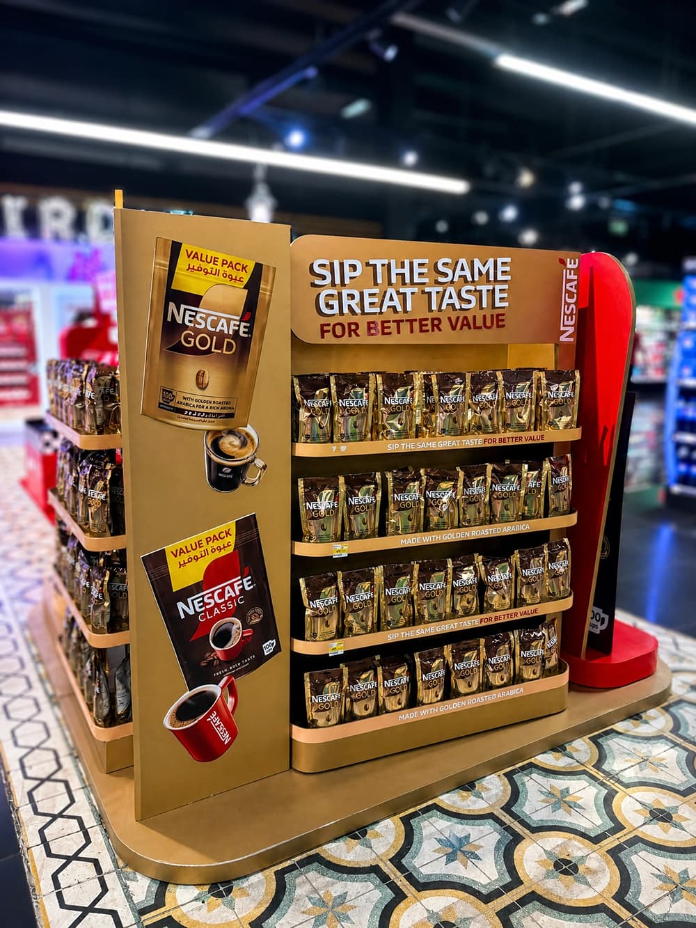
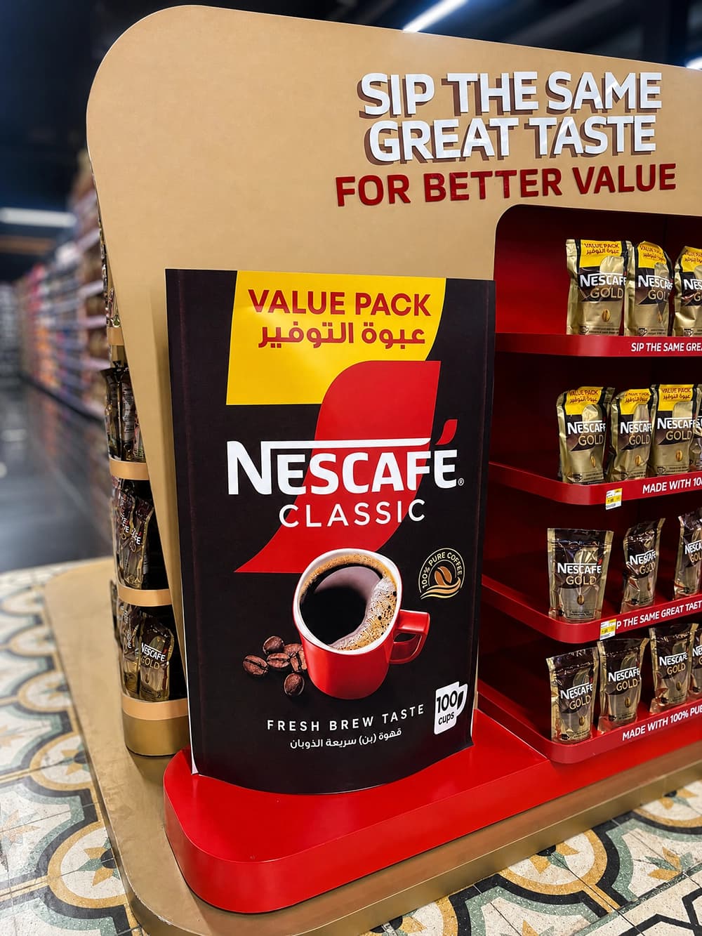
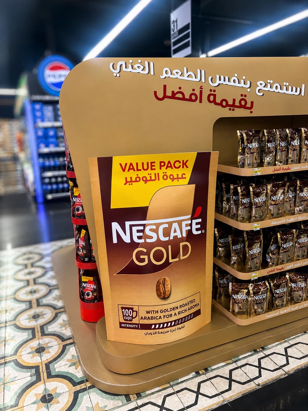
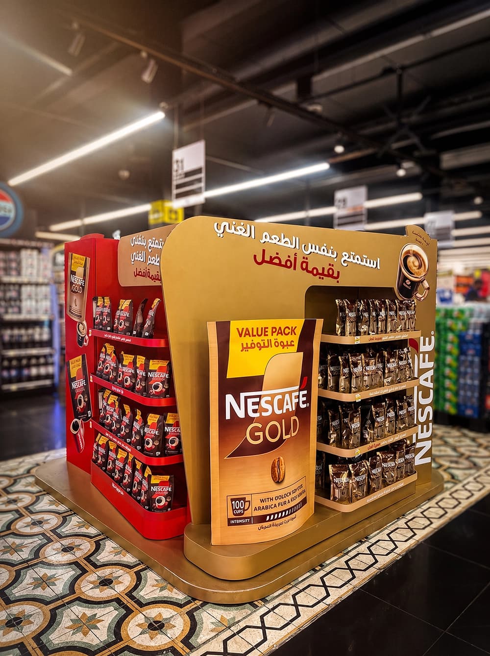
Proink designed and fabricated a freestanding island display with dedicated faces for Nescafé Gold and Nescafé Classic, a curved illuminated header and a central pack shaped panel announcing the value format.
Each side works as its own shop. The Gold face uses warm gold shelving and graphics, the Classic face runs in the brand's signature red, and a shopper approaching from either aisle meets one clear range rather than a mixed wall of packs. The central panel scales the value pack up to a size that reads from across the store, so the offer is understood before the shopper reaches the shelf.
Value without discounting the brand
The messaging reads "enjoy the same rich taste at better value." The design follows that line exactly. The value pack sits inside the Gold world instead of being treated as a promotion, with the same materials, colour and finish as the core range. Nothing about the unit looks like a price cut, and the brand keeps its standing.
Built for the shop floor
Deep stepped shelving holds a high volume of stock at browsing height, and the vertical Nescafé wordmark on the side edge keeps the brand visible when the unit is seen side on from the aisle. It is a display designed to be restocked constantly without looking tired.