

Ritter Sport
Chocolate at Christmas is bought as a gift more than as a treat, which changes what a display has to do. It is no longer competing for an impulse purchase on the way past, it is helping someone choose something to hand to another person. Ritter Sport needed a set of units that worked together as a seasonal range, in a category where almost every competitor reaches for the same red and green.
The build
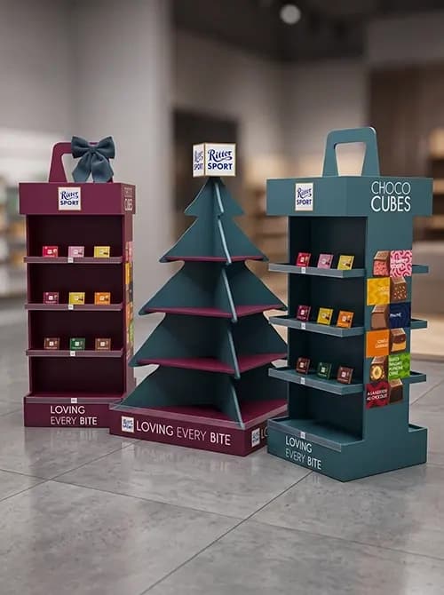
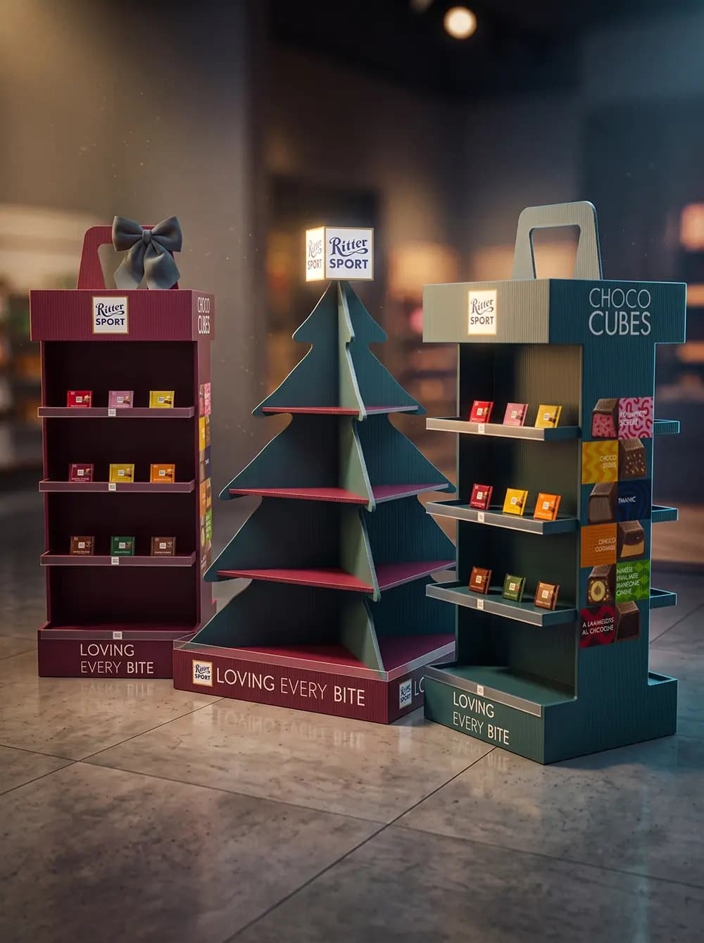
Proink designed and produced a family of three seasonal display units.
*[If these were produced and installed, keep as written. If this was a design proposal only, change "produced" to "designed" and label the images as visualisations.]*
The tree unit is the centrepiece. Rather than decorating a rectangular stand with a Christmas graphic, the whole silhouette is cut as a tree, with triangular shelves stepping outward as the form widens. That means the shelving and the shape are the same decision, which is what stops it reading as a display wearing a costume.
The second unit is treated as a wrapped gift, with a bow mounted on top and the structure proportioned like a present rather than a shelf.
The third presents Choco Cubes, with graphic panels running the full height showing the range and its flavours, alongside tiered shelving.
All three share a construction language: tiered shelves angled to present product face-on, a branded header, a plinth carrying the campaign line, and cut-out carry handles at the top. Those handles matter more than they look, because a unit that one person can lift and reposition gets placed where it sells rather than where it was dropped.
Colour is the quiet decision. Deep burgundy and dark teal, drawn from the packaging rather than from Christmas, so the range reads as seasonal without defaulting to bright red and green.
Product is presented in grids of squares. Ritter Sport's entire identity is the square format, so arranging the bars in rows of squares turns the shelving itself into a restatement of the brand.
Why it works
Building three units instead of one is what makes a seasonal range work commercially. Stores have different amounts of floor space, and a retailer who cannot fit the tree can still take the smaller units, so the campaign reaches more locations from one design investment.
The tree shape solves the recognition problem instantly. A shopper crossing a store reads a silhouette long before they read a logo, and a Christmas tree is the most legible silhouette there is at that distance.
Choosing burgundy and teal over red and green is the most interesting decision here. Seasonal displays are overwhelmingly bright and primary, so a deeper, more restrained palette reads as premium in exactly the moment shoppers are buying gifts and paying more attention to how something looks.
The carry handles are a small detail that changes the economics. Seasonal units get moved several times during a campaign as space frees up, and a display that store staff can reposition alone stays on the floor longer.