

Phreya
Phreya needed a stand that solved a problem specific to retailers. A brand exhibiting alone only has to look like itself. A retailer has to present the brands it carries, give each of them room to be recognised, and still leave the hall knowing whose stand they were standing in. Those two jobs pull in opposite directions.
The build
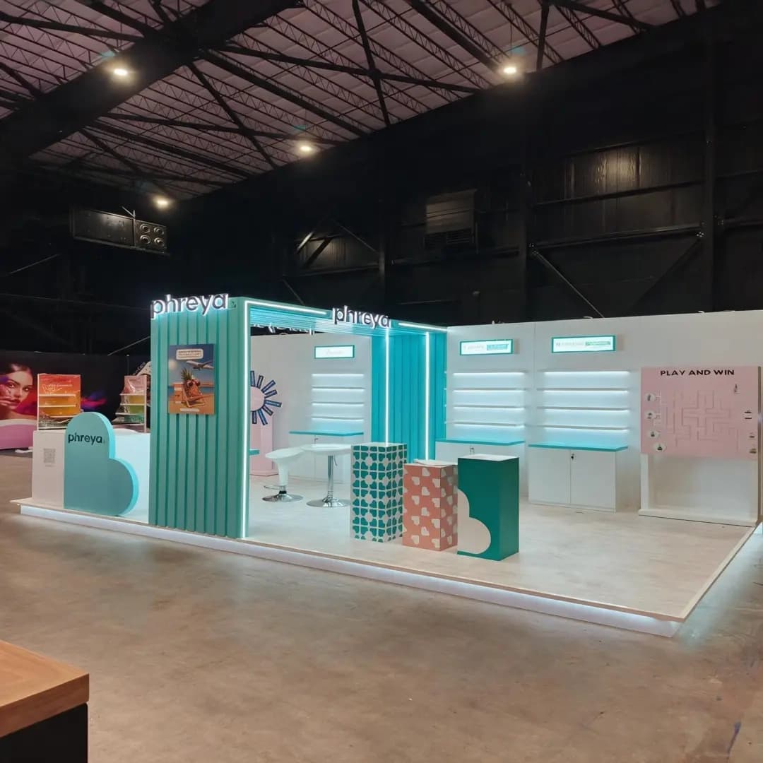
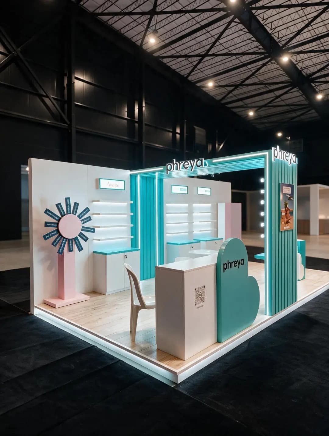
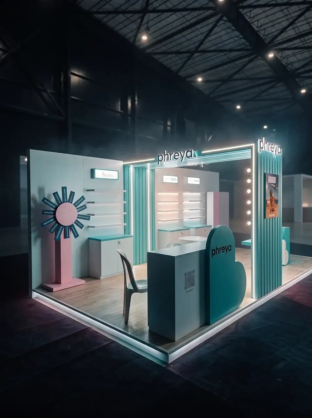
Proink designed, fabricated and installed an open corner stand in mint, pink and white, with illuminated shelving, an entrance portal, a service counter, a seating area and an engagement zone.
The entrance portal does the wayfinding. A framed opening outlined in LED, with the logo lit above it, gives the stand a front door and makes it readable from across a hall where every competitor is also lit. Fluted vertical panels in mint run down both sides, which is what gives the structure texture at a distance rather than reading as flat board.
Shelving is treated as the primary display surface and lit from within. Backlit shelves present skincare properly, because small packaging photographs and reads badly under general hall lighting, and light coming from behind the product is the difference between a shelf that looks stocked and one that looks considered.
Guest brand signage is built into the structure rather than added to it. A dedicated illuminated lightbox carries a stocked brand at eye level, positioned so it reads clearly without competing with the Phreya identity on the portal above.
Shape language is consistent across every element. Cloud and arch forms repeat on the counter, the seating blocks and the wall details, and a vanity-style run of bulbs down one column signals beauty retail before a visitor reads a single word.
The stand also had to work as a place to stand still. Seating, a round table and patterned cube blocks create a consultation area, and a QR code on the counter carries the conversation onward after the show.
Why it works
An exhibition stand for a retailer succeeds when visitors can tell instantly what they will find inside. The lit shelving does that from the aisle: a wall of product visible at distance communicates range faster than any headline.
The prize wheel is doing more work than it appears to. A trade show visitor walks past dozens of stands and enters very few, and the hardest moment to win is the first three seconds. A game gives someone a reason to stop that does not require them to already be interested in the products, and once they have stopped, the rest of the stand can do its job.
Colour is the other advantage. Most beauty stands default to white and gold. Saturated mint against soft pink is unusual enough to be recognisable from the far end of a hall, and it holds up in photographs taken under bad hall lighting, which is how most people will actually see the stand afterwards.
Building the seating area matters commercially. A stand that only presents product generates footfall. A stand with somewhere to sit generates conversations, and in retail buying, conversations are where the business happens.