

Perrier
Perrier is French in a way that goes beyond origin. The green glass, the script logo and the café table are one of the most recognisable images in drinks, so the activation had one obvious answer and one difficult execution. Everyone knows what a Paris terrace looks like, which means anything approximate reads as a costume rather than a place.
The build
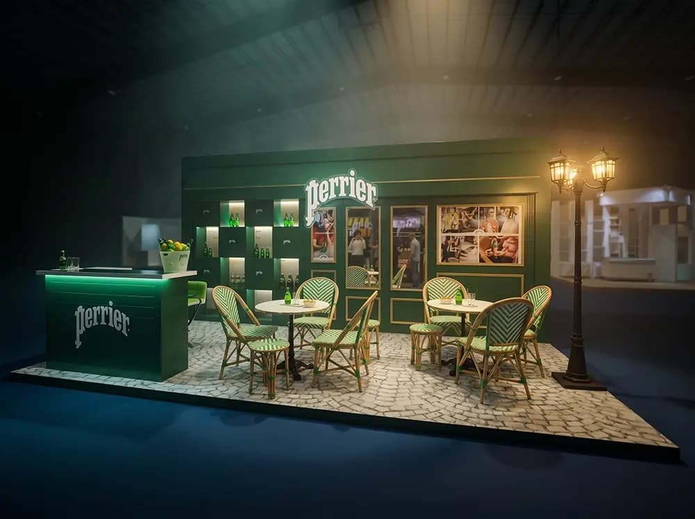
Proink designed and produced a full café terrace, built as architecture rather than as a stand with French decoration applied to it.
*[If this project was built and installed, change the sentence above to: "Proink designed, fabricated and installed a full café terrace..."]*
The façade is the anchor. A dark green shopfront in the bottle's exact colour, with brass trim, framed panels and the script logo mounted centrally, proportioned like a Parisian storefront rather than an exhibition wall.
Product display sits in a grid of backlit niches set into the façade. Recessing and lighting each bottle individually turns a range presentation into something closer to a jewellery display, and green glass is one of the few products that genuinely rewards being backlit.
The bar counter is finished in the same green with an illuminated base, which lifts it visually off the floor and gives the piece a glow at ground level.
Everything below the façade is doing the authenticity work. Cobblestone flooring, classic rattan bistro chairs in green and cream chevron weave, round marble café tables and a twin-globe street lamp. Those are specific objects rather than French-themed props, and the difference between specific and generic is the entire difference between this reading as Paris and reading as a theme.
Framed lifestyle panels along the façade carry the campaign photography, set into the architecture like gallery frames rather than applied as posters.
Why it works
The strongest brands own an image, and Perrier owns a table on a Paris pavement. Building that literally is a rare case where the obvious idea is also the correct one, because the audience already has the picture in their head and the build simply has to match it.
Accuracy is what makes it work. A generic bistro chair, a printed cobblestone floor or a slightly wrong green would each undermine it individually. Getting all of them right is why the piece reads as a place rather than a set, and it is the reason this kind of work is difficult rather than obvious.
Seating is the commercial mechanism. A bar serves someone in thirty seconds and they leave. A terrace with tables invites people to sit down, which is what turns a sample into an experience of the brand in the exact context it wants to be drunk in.
Lighting carries the mood. Warm lamplight against dark green, with the product niches glowing, is evening in a European city, and it is a long way from the flat overhead lighting of the venue around it.