

Pepsi
Pepsi needed permanent shelving that carried the brand properly across a retail network that is not uniform. The same identity had to work in a modern supermarket with wide aisles and good lighting, and in a small neighbourhood market where space is tight and the fixture has to earn every centimetre it occupies.
The build
Proink produced branded gondola shelving systems in two finishes, manufactured and installed across store formats.
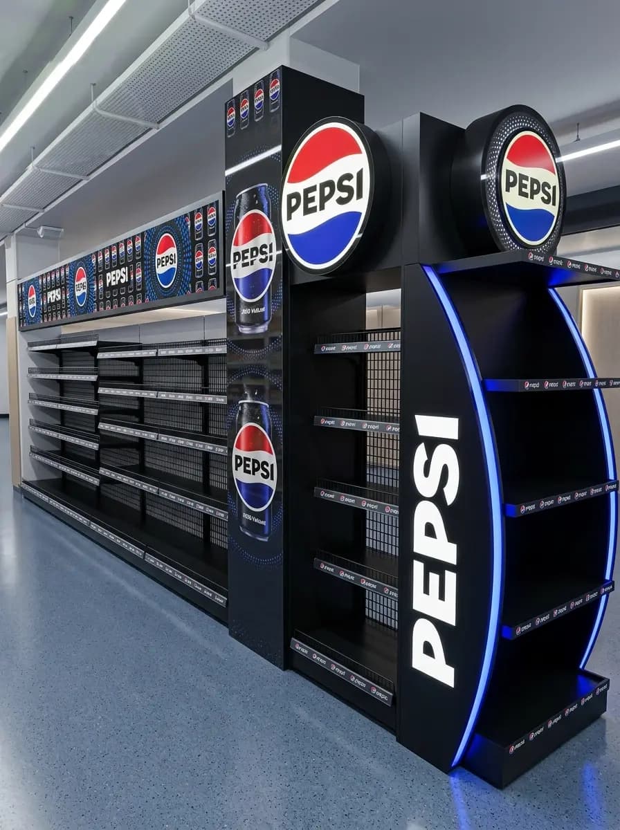
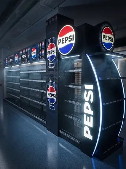
The premium version is built in black with an illuminated curved end cap. The end cap is the piece doing the heavy lifting: it faces oncoming traffic at the head of the aisle, carries the Pepsi name vertically at full height, and is outlined in LED so the unit reads from the far end of the store. Branded header panels run the length of the shelving above the stock, which keeps the brand present even when the shelves are full of product.
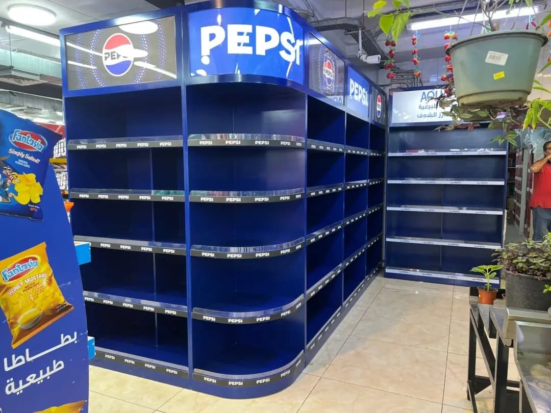
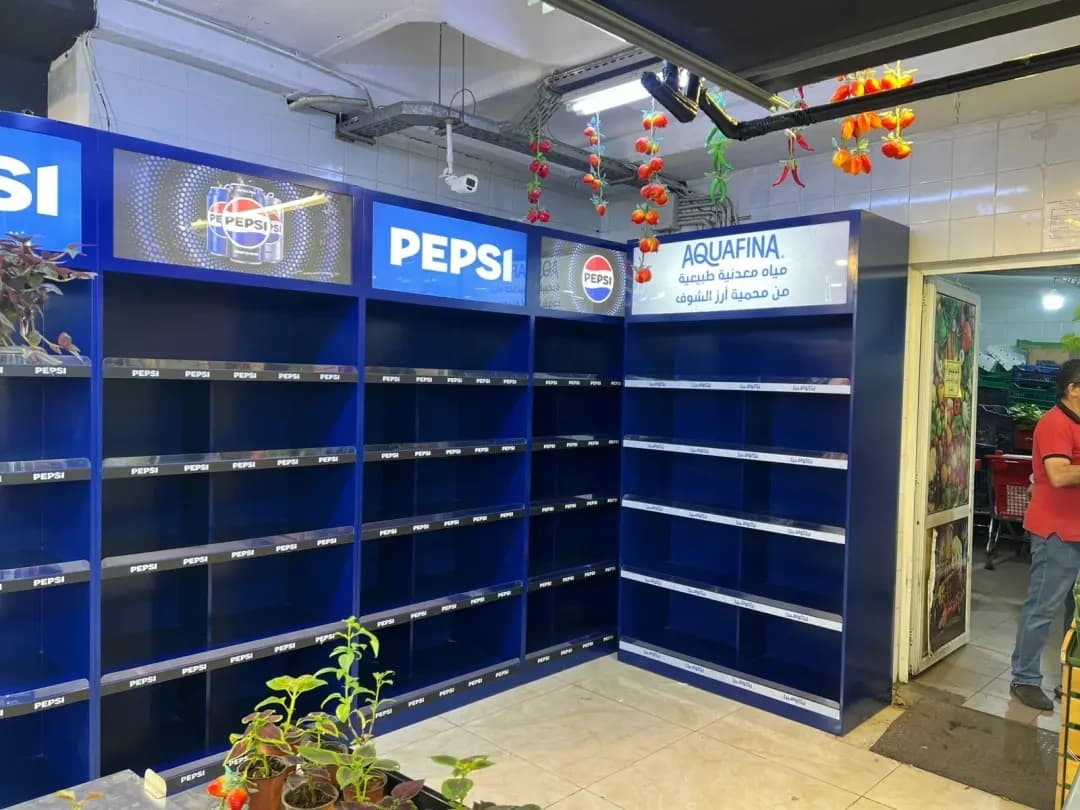
The standard version is built in blue for smaller stores, with illuminated header lightboxes carrying Pepsi and Aquafina. Compact formats need a different approach, because there is no distance for a shopper to appreciate a tall fixture, so the branding sits lower and closer, at the eye level people actually shop at.
Both systems combine metal shelving with printed and illuminated brand panels. That means matching colour across three processes at once, printed panel, powder-coated metal and light passing through an acrylic face. A brand blue this recognisable has no tolerance for drift, and controlling all three in-house is the only reliable way to hold it.
Shelving also has to be engineered for what it carries. Bottles and cans are dense, shelf spans are long, and the unit gets restocked constantly, so the load path and the fixings matter far more than they do on a promotional display.
Why it works
Permanent shelving is a different problem from a promotional display. A display runs for a season and is discarded. Shelving stays, gets restocked hundreds of times, and has to keep looking new while being handled daily by people moving quickly.
Building the brand into the fixture rather than onto it is what makes that possible. The illuminated end cap and the header panels are structural elements, not stickers, so nothing peels, fades or gets knocked off during a restock.
Producing two finishes from one design language is what makes a network rollout work. A single fixture designed for a large supermarket would be unusable in a small market, and letting each store improvise would fragment the brand. Two considered variants keep the identity consistent while respecting what each format can physically hold.