

OATLY
Oatly is a brand built almost entirely on copy. The packaging talks, argues and jokes, and that voice is the product's main point of difference on shelf. The display had to carry that much text without becoming unreadable, hold serious stock in a high-traffic supermarket position, and adapt to different promotional mechanics across the campaign.
The build
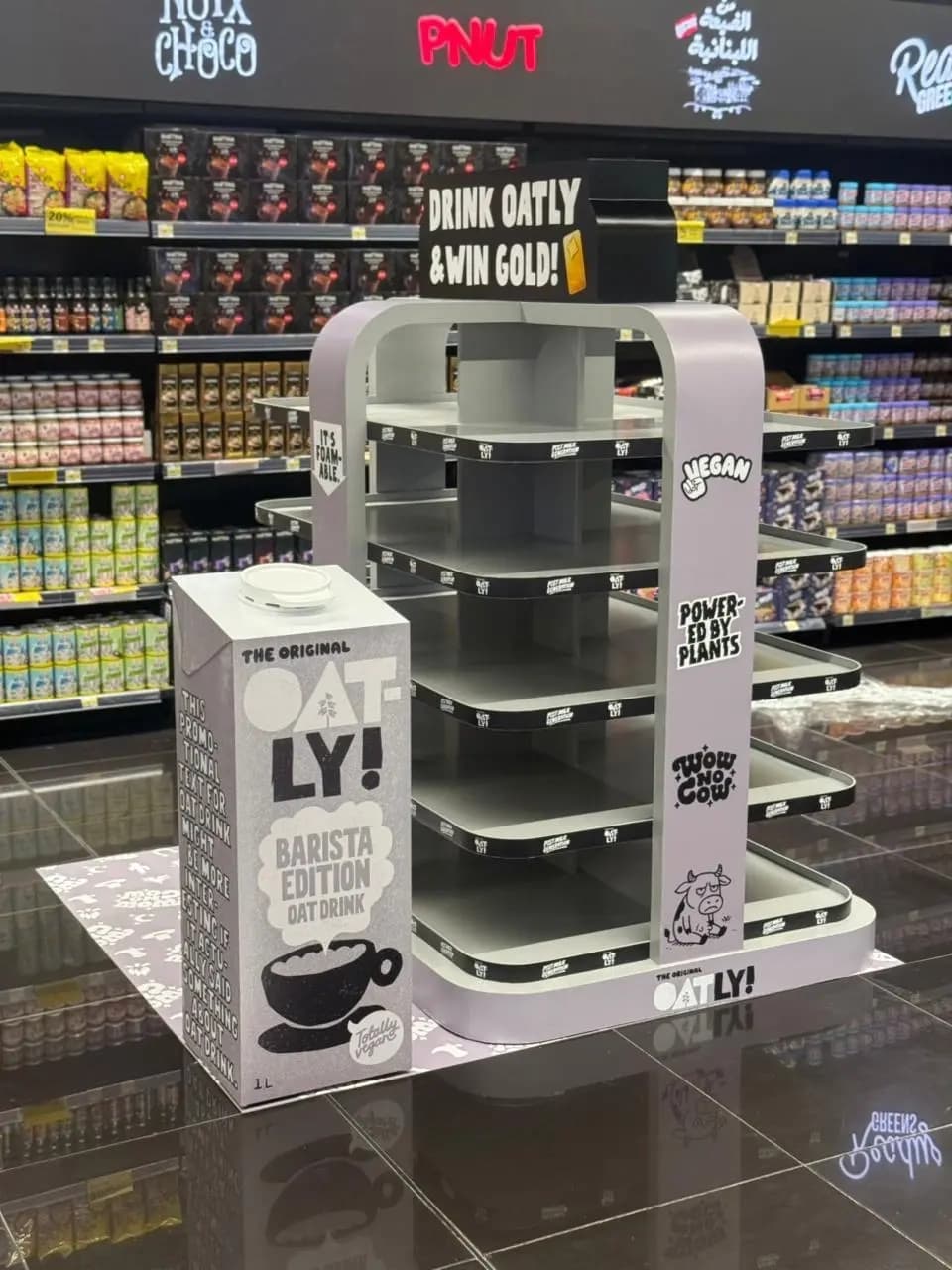
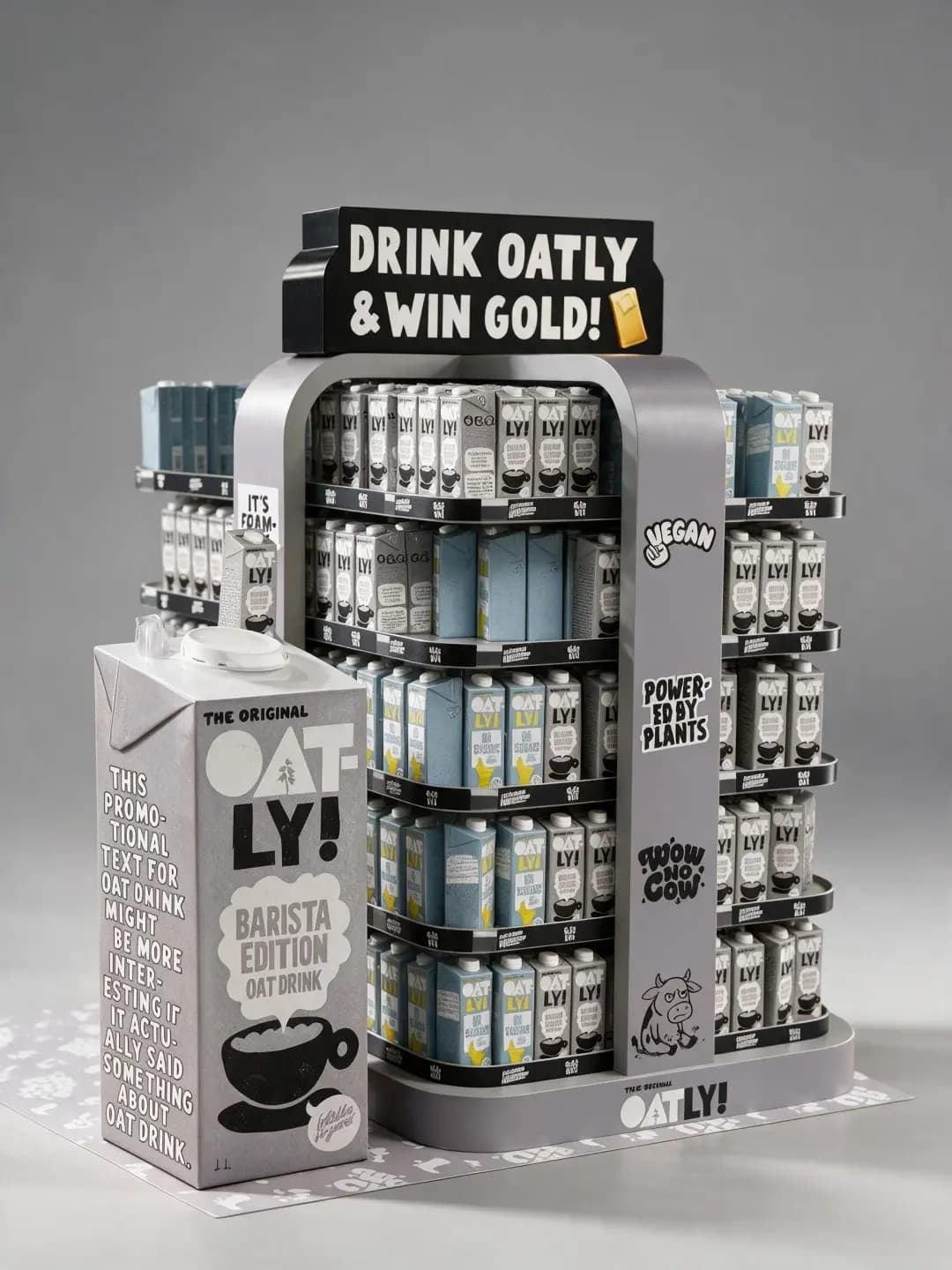
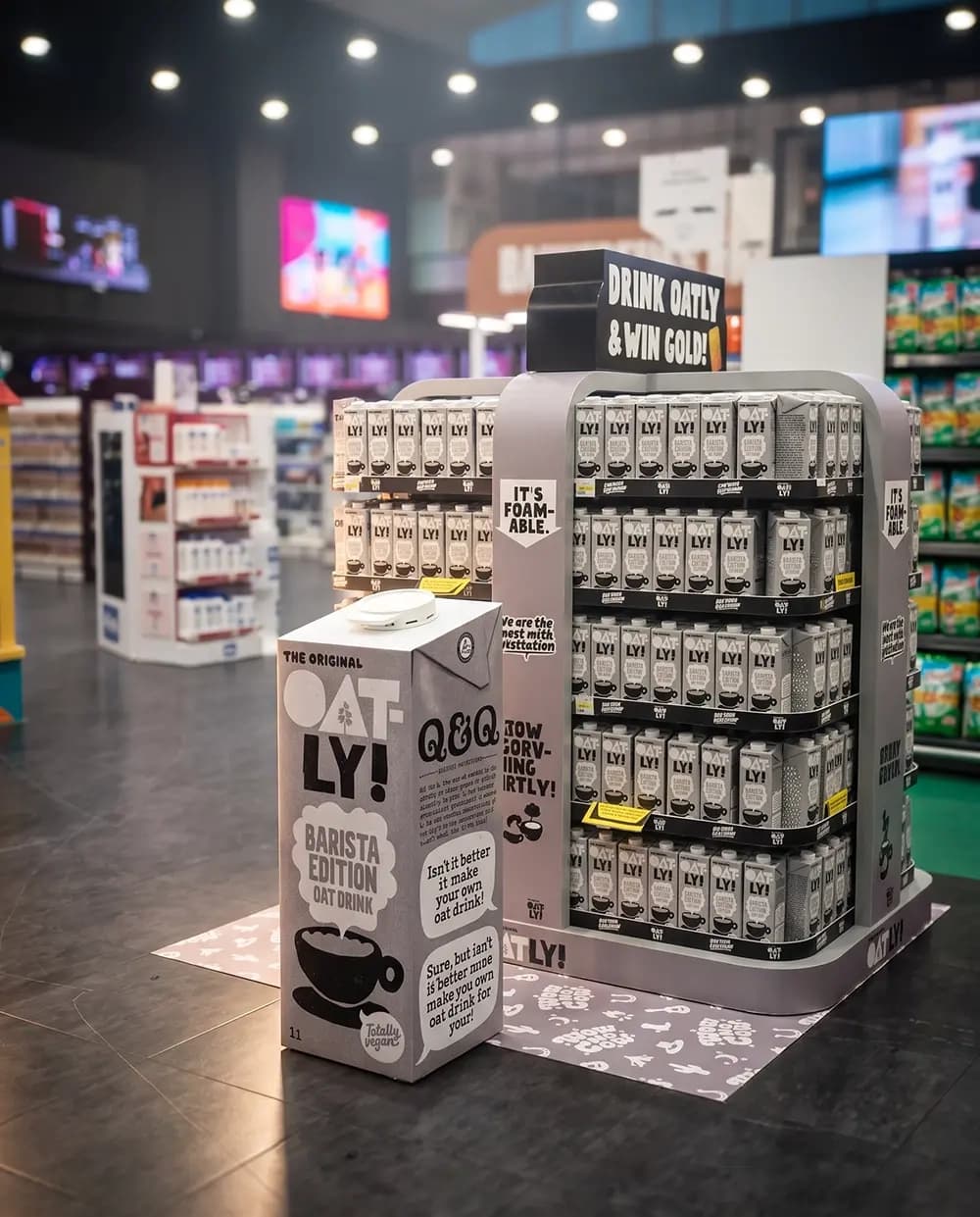
Proink produced a freestanding display unit built as an arch, with tiered trays for stock, printed panels across every visible face and an oversized carton replica standing in front of it.
The arch form is a deliberate departure from standard supermarket furniture. Almost everything on a shop floor is rectangular, so a rounded silhouette separates from the shelving around it before a shopper reads a single word. It also gives the unit a front, which a four-sided rectangular stand does not.
Structure was engineered around the product. Cartons are heavy, they are restocked constantly, and the tiers had to hold full loads without deflecting across the span. The tray depth was set so a shopper can reach the back of the shelf and staff can restock from the front without dismantling anything.
Every vertical surface is treated as copy space. Side panels, uprights and the header all carry printed messaging in the brand's voice, which means the unit had to be designed as a piece of typography as much as a piece of furniture. Panel proportions were set by the length of the sentences, not the other way round.
The header is swappable. Different phases of the campaign carry different mechanics, so a promotional banner can be changed without replacing the unit. That is what turns a single build into something that runs across a whole promotion.
The oversized carton replica is a separate build. Enlarging packaging to floor-standing height exposes every flaw in the folds, the proportions and the print, because the audience knows exactly what the real thing looks like. The tolerance for error is close to zero.
Why it works
In a supermarket aisle full of saturated primary colour, a muted grey unit is the loudest thing on the floor. Contrast is relative, and quiet next to noisy reads as confident. It also matches the packaging exactly, so the display and the product look like one object rather than a stand holding a product.
The oversized carton does the recognition work. A shopper identifies the brand from the far end of an aisle by shape and silhouette long before they can read a label, and a giant version of the pack is the fastest possible way to communicate what is on offer.
Carrying the brand's voice onto the furniture is the part most producers get wrong. A display that simply repeats a logo wastes the strongest asset Oatly has. Treating the unit as somewhere the brand keeps talking means the display works the same way the packaging does.
The swappable header is the commercial decision. Promotions change every few weeks, and a unit that has to be rebuilt each time is expensive. Building the change into the design means the same structure carries the whole campaign.