

Malfy Gin
Malfy is a gin sold entirely on where it comes from. The lemons, the coast, the colour of the Mediterranean. That story is easy to print and very difficult to build, because a printed panel of a coastline reads as a poster and a real place does not. The brief was to make a bar that felt like it had been lifted out of a piazza rather than assembled for an event.
The build
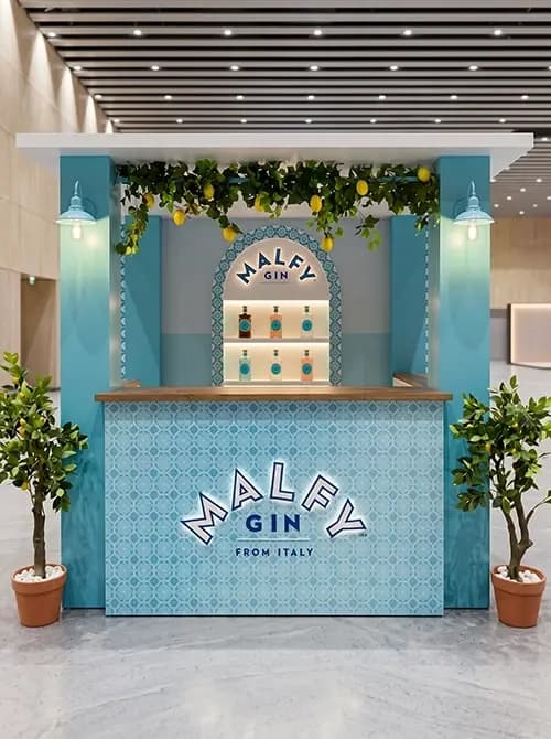
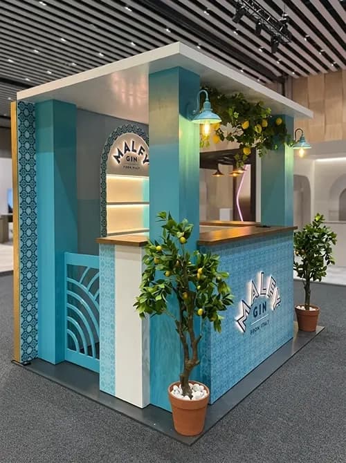
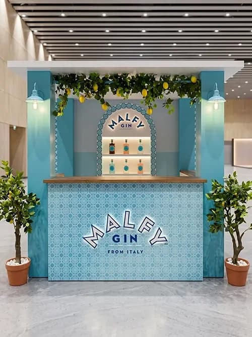
Proink designed, fabricated and installed a bar kiosk built around Mediterranean architectural language rather than applied graphics.
The arch does the structural work. A recessed arched niche behind the counter holds the range on backlit shelves, framed like an alcove in a Mediterranean building rather than presented like retail shelving. Arches recur across the build, in the niche, the fretwork and the counter detailing, which is what makes the kiosk read as architecture.
Surfaces are patterned throughout in a blue majolica tile design, applied across the counter front, the columns and the borders. Pattern is what separates this from a painted blue bar. A flat colour communicates a palette, but a tile pattern communicates a place, because tiles carry associations of Italian and Mediterranean building that paint cannot.
Real lemon trees in terracotta pots flank the kiosk, with a lemon garland running across the top. The lemon is the product's key botanical, so putting the actual fruit on the build makes the flavour argument physically rather than describing it on a label.
Blue enamel pendant and wall lamps light the counter, chosen as fittings that belong to a domestic Mediterranean building rather than to an exhibition stand.
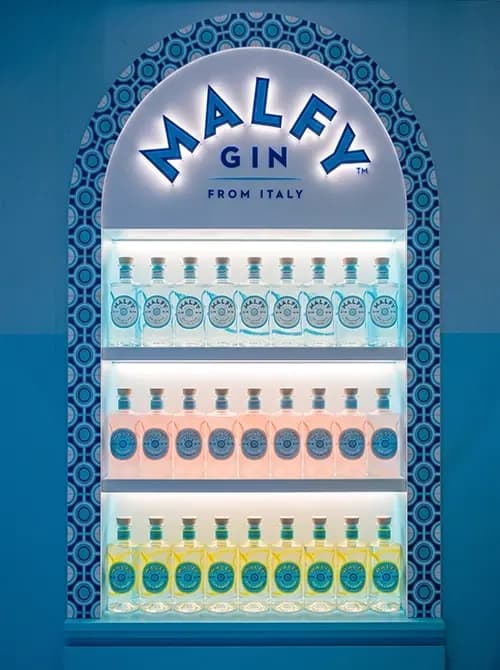
The backlit cooler is a separate piece, arched at the top to match the bar, tiled around the border, with the range lit from within. Fretwork panels in blue provide screening and depth without closing the kiosk off.
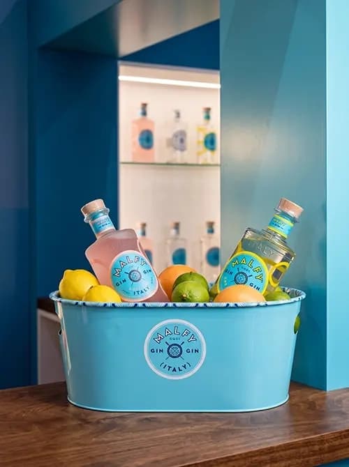
A branded ice bucket, filled with citrus alongside the bottles, completes the serve. Small branded pieces like this are where finish quality shows most, because people pick them up.
Why it works
Spirits are bought on origin, and origin cannot be printed convincingly. A photograph of the Amalfi coast on a bar front tells a customer the brand is Italian. A tiled arch with a real lemon tree beside it makes them feel it, and feeling is what closes the sale on a premium spirit.
Blue is the strategic choice. Almost every bar activation defaults to dark timber and warm light, so a saturated Mediterranean blue is instantly separate in any venue, and it matches the bottle exactly so the build and the product read as one thing.
Citrus does double duty. It is the brand's flavour story and it is the freshest looking material available, so the build stays alive in photographs in a way that a static structure never does.
The backlit arch turns the range into a display worth looking at. Gin is a clear spirit with nothing to show, so light passing through the bottle and the coloured variants is the only way to make the product itself attractive on a shelf.