

KitKat Pistachio Kunafa
KitKat launched Chunky Pistachio Kunafa, a flavour built on one of the region's most familiar desserts, and timed it for Ramadan. That gave the display two jobs at once. It had to introduce a product nobody had tasted, and it had to belong to the season it launched in, without either one undermining the other.
The build
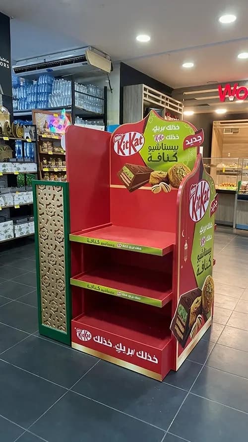
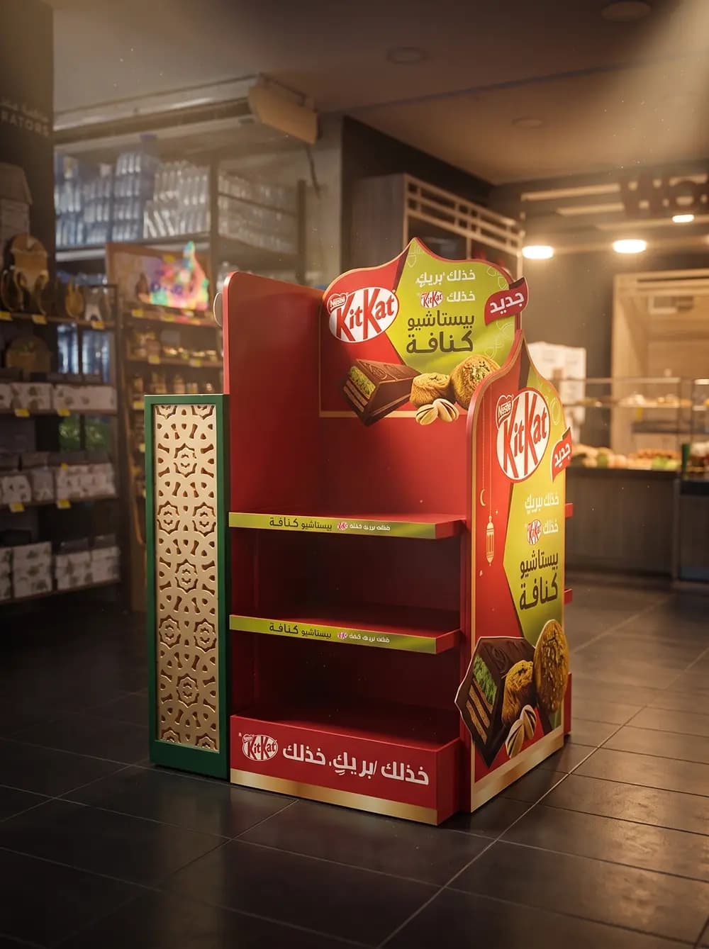
Proink produced a freestanding display unit designed around Ramadan visual language rather than the brand's usual retail furniture.
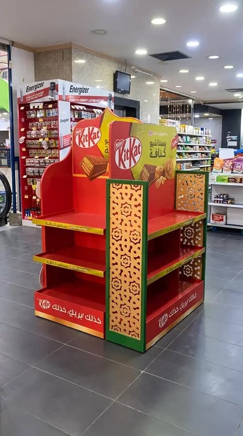
The structure carries fretwork panels in gold, cut in a repeating arabesque pattern and mounted against green uprights. That cut pattern is the most important decision in the build. It gives a flat unit real physical depth, casts its own shadow, and it is the visual language of mashrabiya screens rather than a printed approximation of them. Cutting the pattern rather than printing it is what separates a display that belongs to the season from one wearing it as a costume.
Colour reconciles two identities that do not naturally agree. KitKat is red globally, Ramadan retail is green and gold, and the unit holds all three without either brand or season losing. Red carries the headers and the base, green frames the fretwork, gold does the pattern work and the trim.
The header is shaped rather than rectangular, with a silhouette drawn from Islamic arch forms, and it carries the product visual, the new flavour claim and a lantern motif.
Typography is Arabic first, including a wordplay on the brand's own line. That is the correct hierarchy for the market and the season, and it is a decision many international brands get backwards by treating Arabic as a translation added afterwards.
Shelving is tiered with printed strips along each edge, sized for confectionery, and the whole unit was built to work in very different store formats. Photographs show it in a modern supermarket and in a tighter minimarket aisle, which means the footprint had to earn its space in both.
Why it works
A new flavour has no recognition, so the display carries the entire introduction. Shoppers have never seen this pack, cannot judge it from the wrapper, and will not read a description. Product photography at header height showing the wafer, the pistachio and the kunafa does the explaining in the second and a half available.
Building for Ramadan rather than decorating for it is the difference in this market. Ramadan is the largest retail season in the region and shoppers see hundreds of seasonal units, most of them a standard display with a lantern graphic applied. A cut fretwork panel and a shaped header read as considered, and considered reads as respectful.
The flavour itself is a local dessert, which raises the stakes on authenticity. A global brand borrowing kunafa needs the surrounding design to feel like it understands the reference, or the whole product proposition looks opportunistic.
Working across store formats is what makes the investment pay. A unit that only fits a hypermarket reaches a fraction of the market, and the smaller stores are exactly where impulse confectionery sells hardest during Ramadan.