

House of Olives
House of Olives sells a category that depends on looking fresh, handled and abundant, and it sells it from inside somebody else's store. That is the difficulty. The unit has to read as its own shop, with its own character, while sitting in a supermarket built to a completely different specification. And because the business keeps opening branches, the whole thing has to be repeatable without becoming generic.
The build
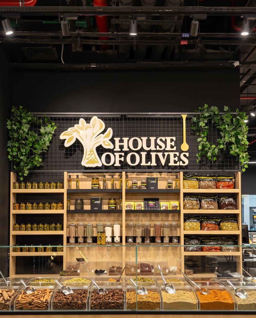
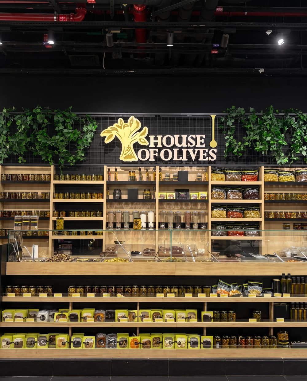
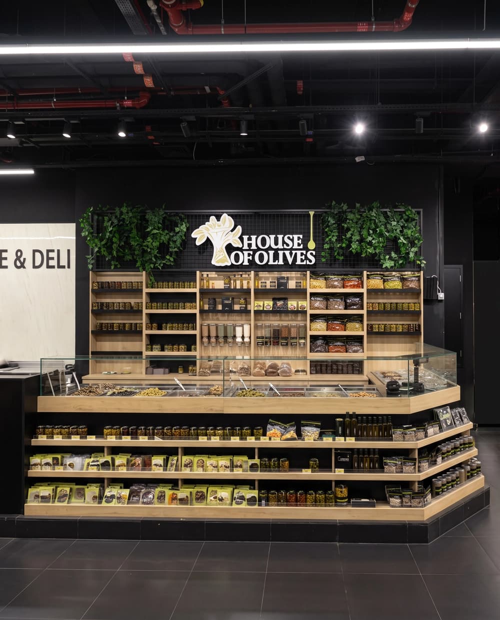
Proink designed, fabricated and installed a complete shop-in-shop island: shelving, service counter, refrigerated display, bulk dispensers, signage and greenery.
The backdrop sets the identity. A black mesh panel wall carries the illuminated logo with trailing greenery around it, which does two things at once. Black separates the concession from the pale supermarket around it, and the greenery signals fresh produce before a shopper is close enough to see any product.
Light timber joinery runs through every shelf, riser and counter edge. Against the black backdrop and dark floor, timber reads as market stall rather than supermarket fixture, which is exactly the association a deli brand wants.
The refrigerated counter is the technical centre of the build. An open chilled well holding loose olives and pickles behind glass has to meet food safety requirements, hold temperature, drain properly and still look like a market display rather than a piece of catering equipment. Integrating refrigeration into joinery that looks handmade is a genuinely difficult combination.
Bulk gravity dispensers sit within the shelving run for grains and dried goods, reinforcing the sense of a shop that weighs and serves rather than one that only stocks.
Tiered stepped displays at the base bring packaged product down to the aisle and out toward the shopper, which increases the effective frontage of the concession without taking more floor from the host store.
Because the concept rolls out across branches, the whole thing is built as a repeatable system. Components, finishes and proportions stay consistent, so a new branch is a rebuild rather than a redesign, and every location looks like the same brand.
Why it works
Olives are bought on appearance. Nobody tastes before buying, so the decision is made on how fresh and how plentiful the display looks, which makes the fixture responsible for the sale in a way that packaged goods never are.
Everything in the build is arranged around abundance. Open wells, full trays, stepped tiers and stacked shelving all read as a business with more than it needs, and abundance is the strongest signal of freshness in food retail.
Separating from the host store is the other job. A concession that matches the supermarket around it becomes part of the supermarket. Black, timber and greenery create a boundary a shopper can see from down the aisle, which is what allows a brand to charge more than the shelf twenty metres away.
Building it as a system is what makes the relationship work. A brand opening branches cannot afford a bespoke design each time, and it cannot afford inconsistency either. A repeatable build gives them both speed and sameness, which is exactly what the client describes in his own words.