

Chivas Regal
Chivas Regal needed a bar in a hall full of premium spirits, where every neighbouring brand was making the same argument about heritage and quality. The brief was effectively one word, gold, which is the most difficult finish to execute in this industry. Done well it reads as luxury. Done badly it reads as plastic, and there is very little distance between the two.
The build
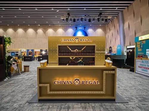
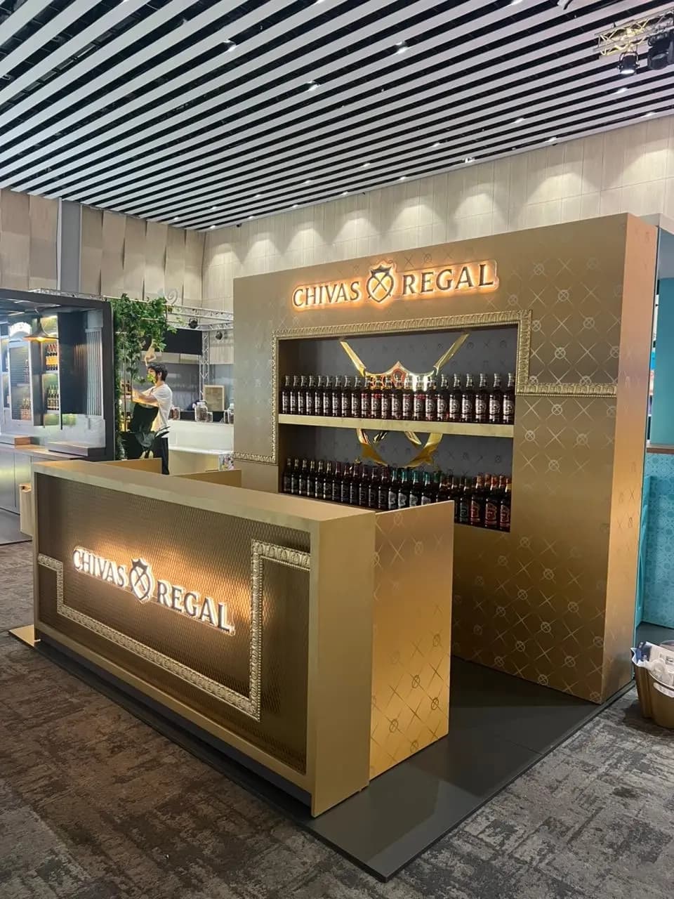
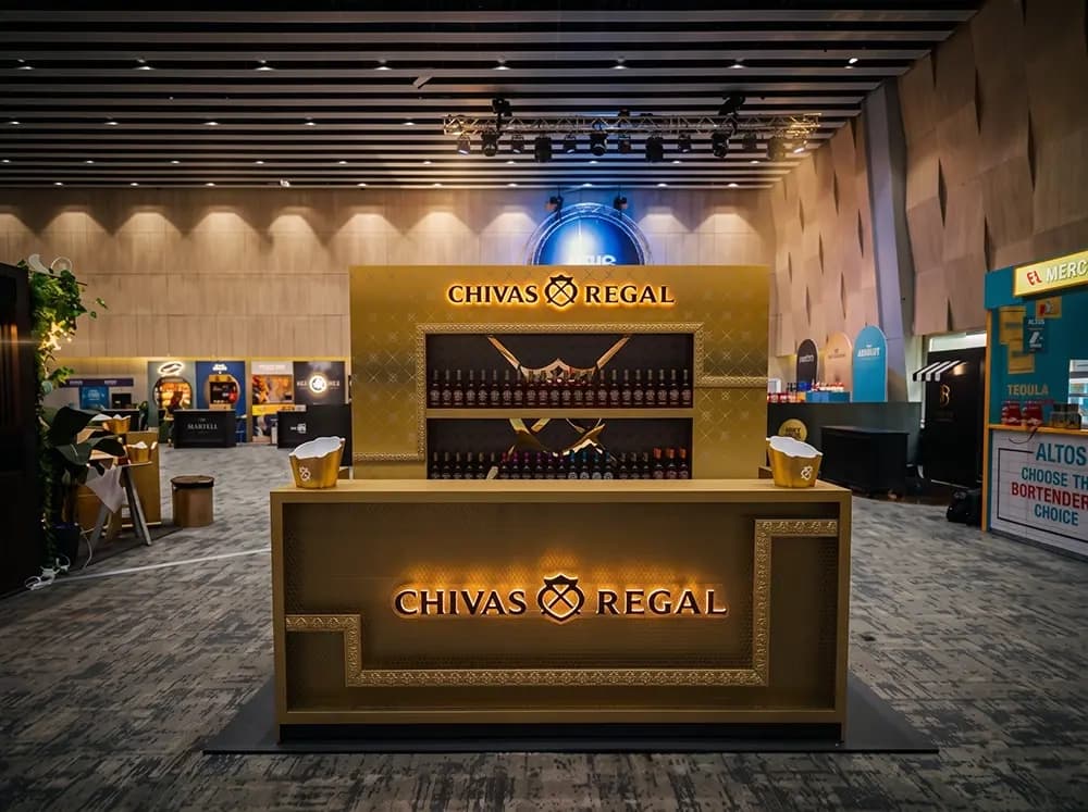
Proink designed, fabricated and installed a full bar unit in gold, with an embossed panel system, a backlit product recess, an illuminated brand sign and a decorative framed bar front.
Gold was handled through texture rather than colour alone, which is the whole technical argument of this build. A flat gold surface reads as paint. An embossed diamond pattern across the panels breaks the light into hundreds of small highlights, and that variation is what the eye reads as metal. The same colour applied flat and applied to a textured relief produce completely different results, and only one of them looks expensive.
The bottle display sits in a recessed dark cavity, lit from within, with the brand emblem rendered in gold across the back. Recessing the product does two things: it frames the range like an exhibit, and it creates the contrast that makes a lit gold emblem read as precious rather than bright.
The bar front carries an illuminated brand block set inside a decorative moulded frame. That frame is a deliberate classical reference, the kind of detail found on picture frames and cabinetry rather than on exhibition stands, and it signals age and craft rather than event build.
The unit was produced as an L-shaped configuration so it works as a service bar with staff behind it, rather than as a display someone stands in front of.
Finishing carried most of the cost and most of the risk. Gold is unforgiving of preparation errors, since every imperfection underneath is amplified rather than hidden by a metallic finish, and any inconsistency between adjacent panels is visible instantly under hall lighting.
Why it works
A premium spirits hall is the hardest environment to stand out in, because every brand is already using the same codes. Dark wood, warm light, restrained typography. Committing fully to a single material, and executing it properly, is more effective than trying to be different.
Texture is what separates this from the competition. Most stands print a metallic effect. This one is physically embossed, so it behaves like metal under moving light and changes as a visitor walks past. A photograph flattens that, but a person standing in front of it does not.
The lighting strategy is doing the selling. Dark recess, lit product, glowing emblem. Whisky is bought on colour, and a bottle lit against darkness shows its colour properly. Everything gold in this build is there to frame the one thing that is not.
Building it as a working bar rather than a display is the commercial decision. At a trade show, a bar that serves generates conversations with buyers. A display that only presents generates people walking past.