

Altos
Altos needed a space that could sell tequila on where it comes from. The brand's whole argument is agave, craft and Mexican origin, and none of that survives being printed on a standard branded counter. The activation had to feel like somewhere with a history rather than a promotion that arrived last week.
The build
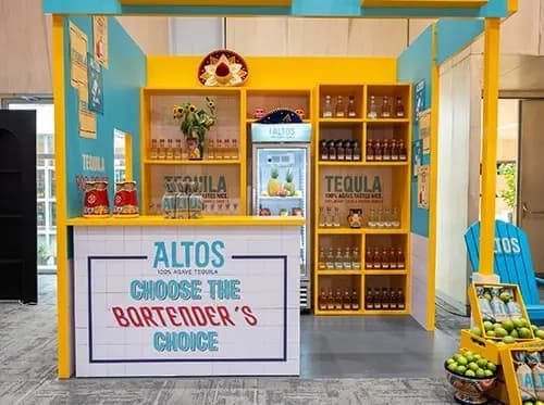
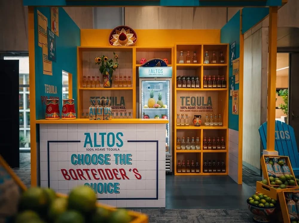
Proink designed and fabricated a cantina-style bar built from yellow timber joinery against teal painted walls, then installed it complete with counter, display shelving, graphics and props.
The structure is deliberately architectural rather than modular. A framed opening, a full-height back wall and open shelving cubbies turn what could have been a table with branding into a room with a threshold. That framing is what makes people feel they are entering somewhere instead of approaching something.
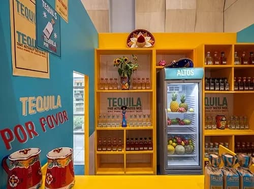
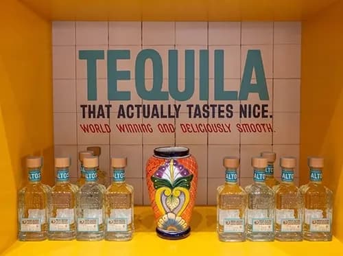
Surfaces carry most of the character. The counter front is tiled and hand-lettered, the back panel repeats the treatment, and the wall graphics are set as painted signage rather than applied vinyl. Tile and hand-painted lettering read as made by someone, which is the opposite signal from a printed panel, and that difference is the entire point for a brand selling craft.
Colour does a lot of work here and had to be controlled precisely. Saturated yellow joinery against teal is a narrow palette with no room for drift, and it appears across painted timber, printed graphics and tiled surfaces at once. Matching a colour across three different processes is only reliable when one team handles all three.
The build also had to accommodate a working setup rather than just a display. A branded cooler is integrated into the shelving run, the counter functions as a serving surface, and fruit crates sit within reach, so the space operates during an event instead of only photographing well.
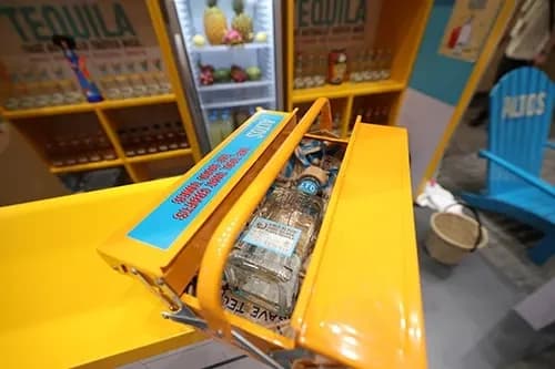
A separate angled cradle presents a single bottle at the counter, tilted forward with a printed band across it. Small pieces like that are where finish quality shows most, because they are handled and seen from centimetres away.
Why it works
Tequila is bought on story. A shopper choosing between bottles at similar prices is choosing between origins, and no amount of logo placement communicates that. Building an environment does, because the visitor reads the tiles, the ceramics and the sunflowers before they read a single word of copy.
The props are doing real work rather than decorating. Talavera ceramics, a sombrero, sunflowers and crates of limes are all specific rather than generic Mexican shorthand, and specificity is what separates authentic from themed.
Open shelving stacked with bottles solves a different problem. Abundance reads as confidence, and a wall of product suggests a brand with range and history rather than a single line being pushed.
The counter message closes it. "Choose the bartender's choice" positions the brand as the professional's pick, which is the most persuasive argument a spirits brand can make in a room full of people deciding what to drink.