

Alpro
Plant-based drinks are bought on taste, and taste has to be experienced rather than claimed. Alpro needed a stand that could hold stock and carry the brand, but that also worked as a place for a promoter to stand and serve. That makes it a working unit rather than a display, and it changes almost every decision about height, footprint and how the thing is put together.
The build
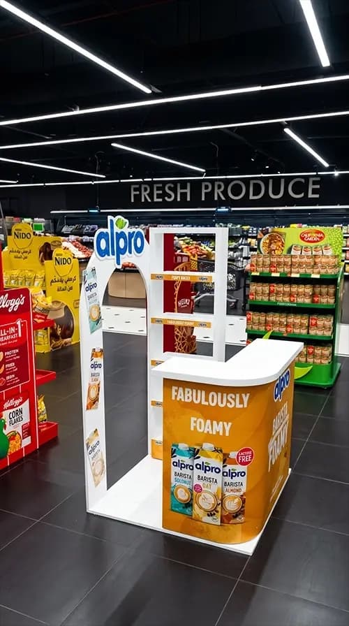
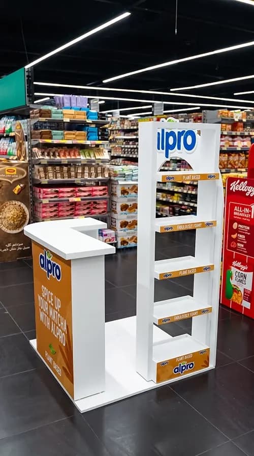
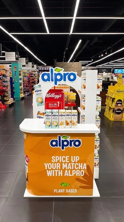
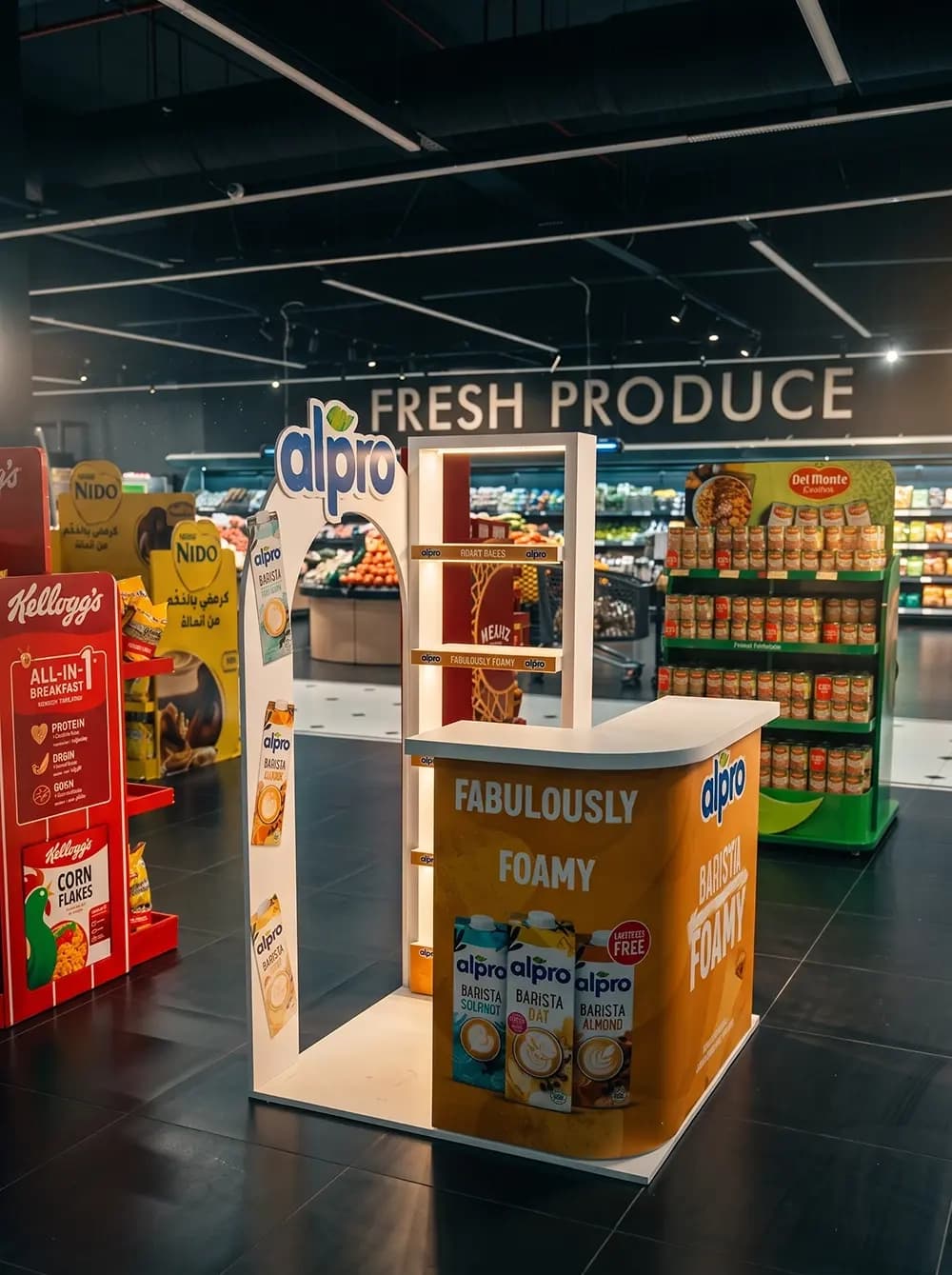
Proink produced a modular sampling unit built around an arched frame, with a counter, product shelving and printed category strips, designed to be deployed in more than one position across a store.
The counter is the part doing the functional work. It has to sit at the right height for someone to pour and hand over a sample, provide a surface with enough depth to work on, and hide stock and equipment underneath, all without taking more floor space than a retailer will give up.
The arch above it does the visibility work. In a supermarket, most fixtures are rectangular and roughly the same height, so a raised arched frame with the logo on it lifts the brand above the shelf line and marks the position from a distance.
Shelving is integrated into the arch structure with printed strips along each tier carrying the brand and the range messaging. Those strips are cheap surface area that most stands waste, and they keep the brand present at eye level even when a shopper is looking at product rather than signage.
The unit was built to move. Photographs show it in different positions and different aisles, which means the structure had to be assembled and reassembled without losing its finish, and had to work against several different backdrops rather than one planned location.
Colour was held to white with an orange base and blue brand marks, which is deliberately restrained for the environment it sits in.
Why it works
The aisles around this stand are extremely loud. Kellogg's red, Nido yellow, Del Monte green, all shouting at once. A white unit with a single orange band is the only quiet thing in the frame, and quiet reads as premium in a category where most competitors are still shouting.
Positioning next to fresh produce is the smartest decision in the project. A plant-based drink sitting beside fruit and vegetables borrows the freshness of everything around it, which no amount of packaging design can achieve on a shelf between cereal boxes.
The arch is doing brand work as well as visibility work. A soft curved form reads as natural and organic, which supports the plant-based positioning in a way that a square unit would quietly undermine.
Building for a promoter rather than for a shelf is what makes the whole thing pay. A display gets glanced at. A person handing you a sample gets thirty seconds of attention and a taste, which for a product people have never tried is the only thing that reliably converts.