

Nok Nok
Nok Nok delivers groceries, beauty and more in thirty minutes, so the brand's entire proposition is speed. A launch activation had to make that felt rather than stated, work as a physical showcase for an app that has no physical form, and present several product categories at once without becoming a trade stand.
The build
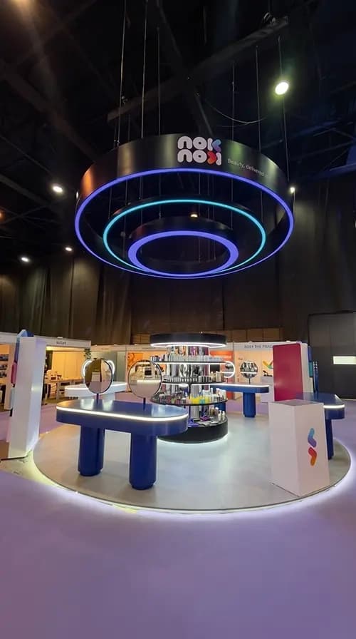
Proink designed, fabricated and installed the full activation, from the entrance structure through to the product zones and the photo moments.
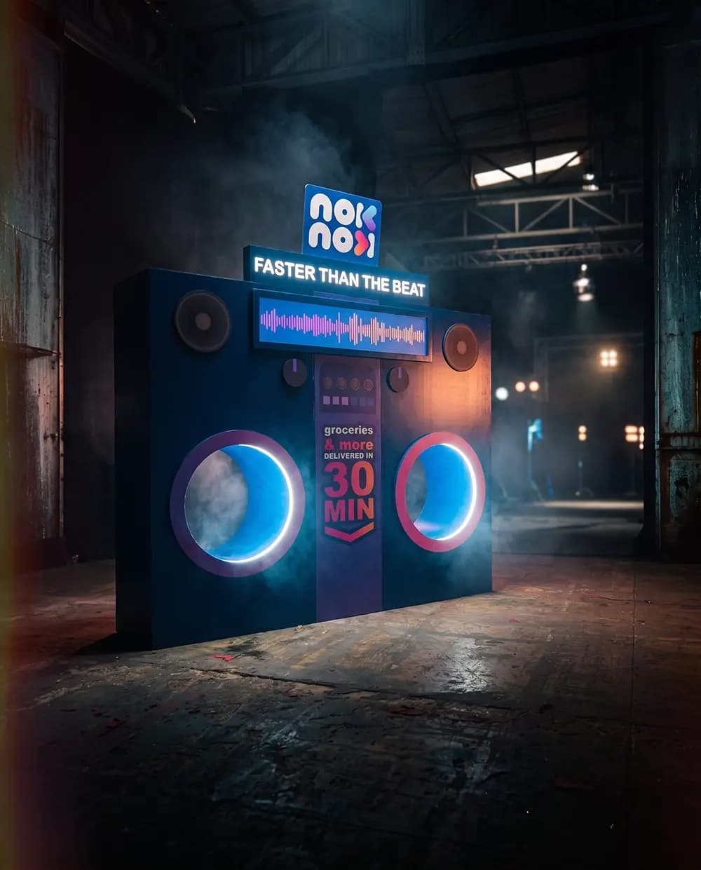
The centrepiece is an oversized boombox, carrying the campaign line and the thirty minute delivery promise across an illuminated waveform panel. Speed is difficult to build. It has no shape of its own, so it has to be borrowed from something the audience already associates with tempo, and a boombox does that instantly.
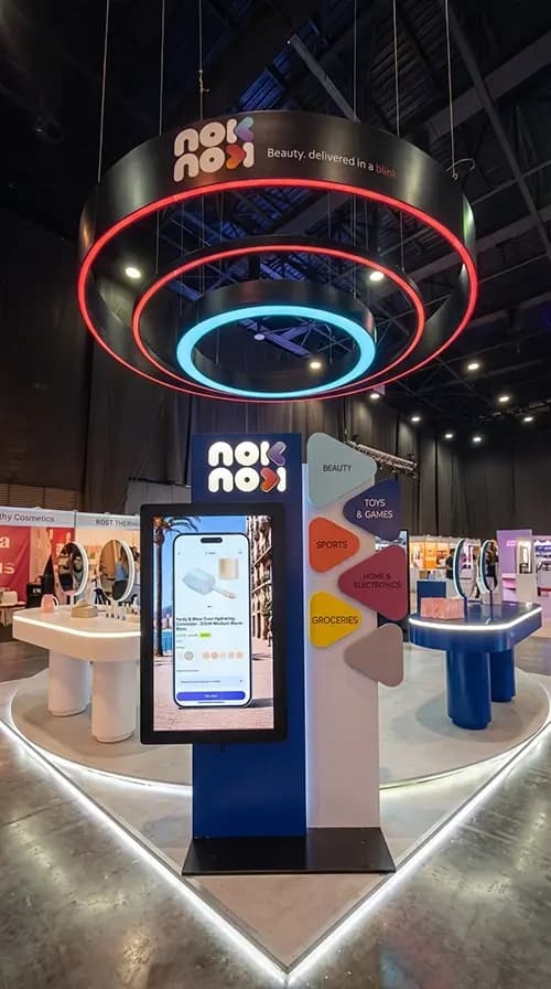
The idea then carries into the architecture. Circular illuminated rings appear throughout the space, on the ceiling feature, around the app screen and framing the mirror booth, all of them reading as speaker cones. That is what holds a multi-zone environment together as one place rather than a group of stands sharing a colour.
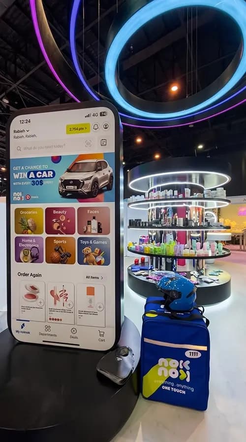
An oversized phone screen presents the app itself at scale, which solves the central problem of building a physical space for a digital product. The interface becomes an object people stand in front of rather than something described on a panel.
Product zones handle the categories the app sells, with shelving, counters and display units so visitors can browse the range physically.
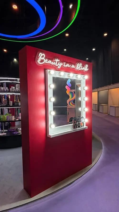
A separate beauty booth with an illuminated vanity mirror gives the category its own moment, and gives visitors a reason to stop and stay.
Illumination is the technical centre of the whole build. Lighting integrated into a structure has to be planned at design stage, not added afterwards, because the cavity, the power routing and the diffusion all have to exist in the drawing before anything is cut. Get that wrong and the light reads as an attachment rather than part of the object.
Scope covered design, 3D rendering, fabrication, print and installation. One team owned the unit from sketch to the final bolt, so the render the client approved was the unit that opened.
Why it works
The strongest brand activations translate a promise into a form, and this one turns delivery speed into sound. A visitor does not need the concept explained, because a boombox already means tempo, energy and immediacy before they read a word.
Building the app at scale solves the problem every digital brand has at a live event. An app lives on a screen four inches wide, which is invisible in a room, so enlarging the interface into a physical object is the only way to make the actual product present.
Repeating the ring form is what makes several different zones feel like one environment. Beauty, grocery and the app all need different furniture, and without a shared element the space would read as a small trade show rather than a brand's own world.
The mirror booth is where attention converts. Everything else creates interest, but a lit mirror is the fixture that makes someone stop moving, and stopping is the precondition for everything an activation is trying to achieve.