

Mazen Online
Mazen is one of the largest pharmacy retailers in Lebanon, and the stand had two jobs that do not naturally sit together. It had to present the many brands the business carries, each with enough space to be recognised, while establishing Mazen itself as the name people remember. It also had to make an online retailer feel physically substantial, which is a specific problem for any business whose storefront is a website.
The build
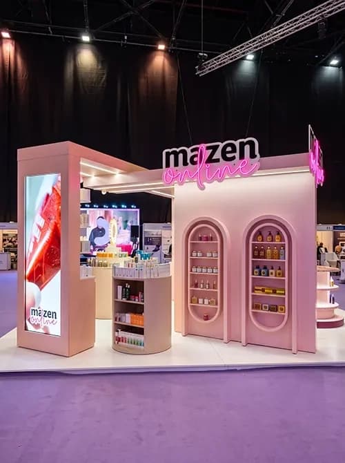
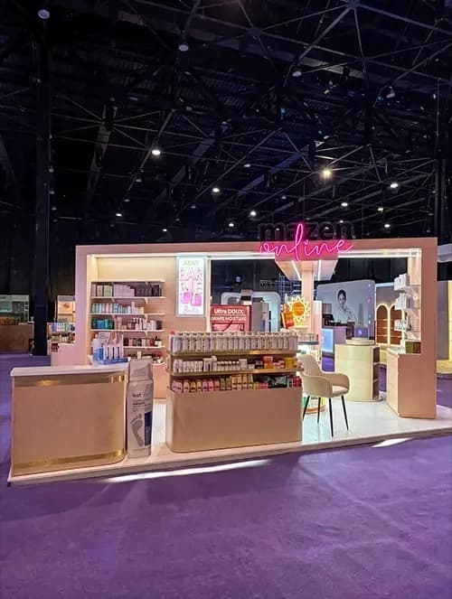
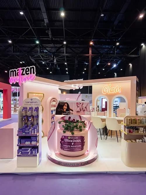
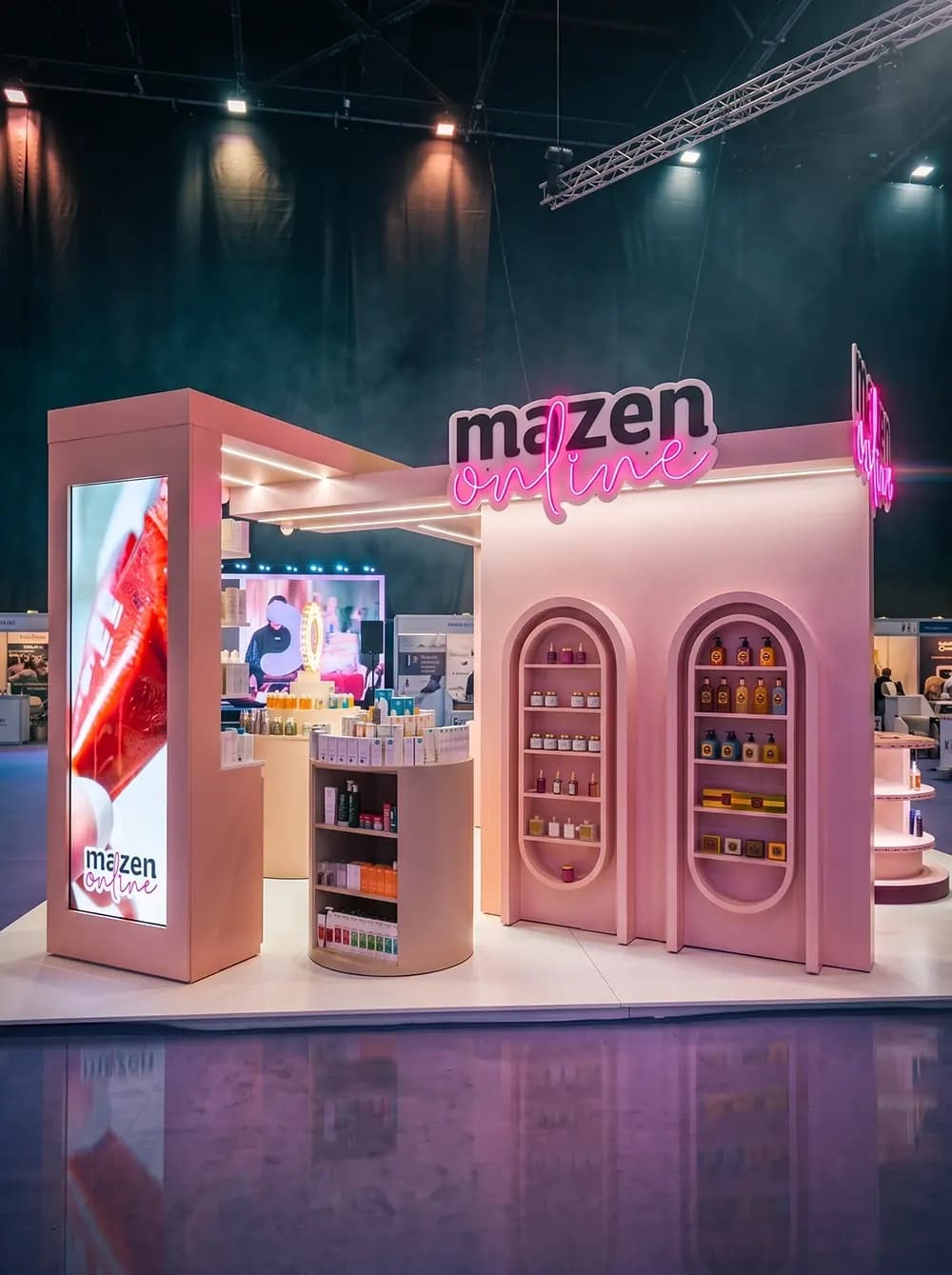
Proink designed, fabricated and installed a large multi-zone stand built around arched forms, in a warm blush and cream palette.
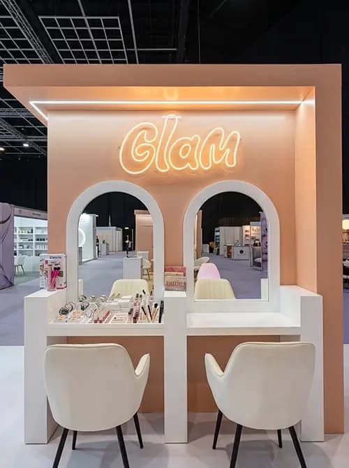
The arch is the organising idea and it repeats at every scale. Full-height recessed display niches, mirrored beauty stations, smaller shelf openings. Repeating one form across a stand this size is what holds it together, because a large footprint with several different zones will otherwise read as separate stands pushed against each other.
Product presentation is handled through recessed niches rather than open shelving. Setting a shelf back into a wall frames the product like an exhibit and creates its own shadow line, which is what gives a display depth. Open shelving in front of a flat wall never achieves that.
A full-height LED screen tower sits at the corner of the stand, which is the piece doing the work of proving an online business exists physically. For a digital-first retailer, a large moving screen is the honest translation of the brand rather than decoration.
Neon signage carries the identity, with the brand name and zone markers rendered as illuminated script. Neon reads as contemporary and consumer, which is precisely the opposite of how pharmacy retail usually presents itself.
Brand partner zones are built into the structure so suppliers get proper presence, with dedicated shelving, feature displays and their own signage, positioned so they support the stand rather than compete with it.
A beauty trial station with mirrored arches, counters and seating gives visitors somewhere to sit and try product, and a separate seating and table area handles longer conversations with suppliers and buyers.
Why it works
The strategic move here is refusing to look like a pharmacy. Pharmacy retail defaults to white, clinical and functional, which communicates trust but nothing else. Blush, cream, warm light and arches communicate beauty retail, and beauty is where the margin and the growth in this category actually sit.
Repeating the arch is what makes a large stand feel designed rather than assembled. At this footprint, visitors experience the stand as a sequence of zones over time, and a consistent form is what tells them they are still in the same place.
Hosting partner brands generously is commercially smart rather than a compromise. A retailer's stand exists partly to sell shelf space and partnership to suppliers, so a supplier who sees their brand well presented is a supplier more likely to invest next year.
The trial station is where the stand earns its return. Everything else creates attention, but a mirror and a stool create the two minutes in which someone actually engages with a product, and for a beauty and pharmacy retailer that is the whole point.